The 2020/21 Premier League home kits have been ranked from worst to best by talkSPORT, and once again, it’s got plenty of talk on social media.
It’s been another summer of newly unveiled strips, however it seems the coronavirus pandemic has left the creatives at Adidas and Nike saying “fuck it, do what you want, no one’s arsed” it would seem.
At the time of giving their verdict, Fulham were the only side to not release a new strip, however since then, they have, so we will have a guess at where we think they would have been placed.
It’s not to say there aren’t any decent ones about, but just which ones have been ranked the best of them all? Without further ado, why not check out what talkSPORT writer Joe Coleman had to say…
20) CRYSTAL PALACE
talkSPORT said via their website: “The Eagles have been bold in their new home strip, something you have to applaud.
“However, this design just falls a tad flat because the top and bottom half just do not look like they match at all. It feels as though the two designs have been somewhat mashed together.
“What is even worse is the fact Chelsea’s third kit looks like a better option for Palace’s home strip.”
18) MAN UTD
talkSPORT said via their website: “Firstly, it looks extremely similar to the 2017/18 strip with the crew neck collar and three stripes on the shoulder.
“But you just cannot ignore the pattern on the front of the shirt which genuinely looks like something you sit on whilst making your way into the Trafford Centre.
“Last season’s strip commemorating the 1999 Treble winners was a hit, this year is unfortunately not.”
17) EVERTON
talkSPORT said via their website: “There is a certain sense of nostalgia with football fans of this generation and Hummel, perhaps extending back to the 1992 European Championships with Denmark.
“While Everton’s new kit doesn’t quite manage to achieve the same iconic status, fans will be hoping to finally end their silverware drought in this new number.
“You can’t help but this looks an awful lot like the current Rangers strip, made by the same manufacturer.”
16) WEST BROM
talkSPORT said via their website: “The Baggies ended their two year exile from the top flight under the guidance of Slaven Bilic last season, with fans eagerly awaiting their first Premier League kit since 2018.
“Unfortunately, the new design is unlikely to capture the imagination in quite the same way Bilic’s swashbuckling side manage to do so.
“The difference in the thickness of the stripes looks a tad confusing, to say the least.”
15) ASTON VILLA
talkSPORT said via their website: “For fans, this kit is a throwback to the 2007/08 team which captured the imagination of fans under Martin O’Neill.
“With the likes of Ashley Young, John Carew and Gareth Barry all donning the claret and blue, Villa looked certain to break into the European places.
“Admittedly, fans will have slightly lower expectations this season, yet at least they will look the part with the subtle pinstripes a nice touch.”
13) CHELSEA
talkSPORT said via their website: “There is nothing ‘wrong’ with their new strip for the upcoming season, but it just doesn’t offer much.
“Despite signing some extremely talented stars in a stellar transfer window, Frank Lampard’s side will need to provide the excitement on the pitch as their new strip is unlikely to cut it.”
“It’s a safe option after a rather garish shirt pattern last year, unlike Lampard’s transfer policy so far.”
13) WOLVES
talkSPORT said via their website: “Ever since returning to the Premier League in 2018, the Wolves home shirt has been getting darker and darker.
“When they first came back, it was practically yellow and kit manufacturer adidas have settled on a very deep gold this year.
“It’s not quite as bold as the 1996-98 strip, nor is it as understated as the 1988-89 edition. Falling somewhere in the middle next year will see Wolves move much higher up the list.”
12) SHEFFIELD UTD
talkSPORT said via their website: “The Blades were bold and adventurous last year, so it is fitting adidas have reflected that in their number for Chris Wilder’s team to wear this year.
“A firm white and black collar extends into the shoulder area, with the classic red and white stripes dominating the body.
“You can’t help but feel as though the large sponsor is a bit of an eyesore and takes off crucial style points.”
11) LEEDS
talkSPORT said via their website: “The best thing about the kit is the Premier League badge on the side, absent since 2004.
“Marcelo Bielsa’s men are unlikely to make many headlines with this strip, instead letting their exciting and enthralling brand of football do the talking.
“However, it looks extremely like Cardiff City’s 2018/19 away strip, a season which saw the Bluebirds drop straight back down to the Championship…”
10) SOUTHAMPTON
talkSPORT said via their website: “The Saints were largely ridiculed for their kits last season and have duly taken notes to deliver a far more attractive product.
“The home shirt evokes memories of Tottenham’s 2015-16 kit with the ‘seatbelt’ design, yet the contrast of the red and white and the bravery to go against the grain reflect well on adidas.
“Hooped socks are always a winner and the black shorts work well with the home shirt; the typically efficient Ralph Hasenhuttl will be delighted.”
9) BURNLEY
talkSPORT said via their website: “The Clarets are one of many clubs on this list where the design is pretty much guaranteed to stay the same, which means it is very easy to get it totally wrong.
“Yet that is not the case here, with Umbro producing a rather slick home shirt for the Clarets.”
8) LIVERPOOL
talkSPORT said via their website: “The Reds celebrated winning the Premier League for the first time in the history with a lucrative deal with manufacturing giants Nike.
“The nod to the club’s history is a great touch with the teal trim reminiscent of the kits used in the 90’s by the likes of Fowler, McManaman and the rest of the ‘Spice Boys’.
“The overlapping white collar is a lovely touch, yet the white piping down the side takes some of the gloss off this number.”
7) WEST HAM
talkSPORT said via their website: “The past few years have been somewhat chaotic on the pitch for the Hammers, which was represented in their kits as well.
“The claret shorts and socks did not go down well with fans at all last year, while the season before that saw the club walk out in almost exclusively claret shirts and no blue whatsoever.
“This time around, it feels like a much more classic West Ham kit; perhaps because it is almost identical to the kit they were in during their last season at Upton Park. Trouble is, that one was much nicer.”
7) FULHAM
At the time of giving their verdict, Fulham were the only side to not release a new strip, however since then, they have, so we guessed at where we think they would have been placed.
The kit has gone a similar template to the Sheffield United home kit along with Wolves’ controversial away strip. However out of both, we at FanBanter believe this is the best out of the three.
It has also gone down very well with the Cottagers fanbase on social media, so we can surely see a healthy amount of sales for this one.
They’ll be hoping it doesn’t become another Fulham Premier League kit to have experienced a relegation season.6) TOTTENHAM
talkSPORT said via their website: “Getting the Spurs kit exactly right can be a tricky scenario, but it seems as though Nike have struck gold here.
“Much like the kit worn in their last season at White Hart Lane, the combination of navy and white works perfectly and the hint of yellow in there is a nice touch too.
“The pattern on the front of the shirt is a touch distracting, but this is otherwise a strong effort from Tottenham.”
5) LEICESTER
talkSPORT said via their website: “The Foxes have seemingly been incapable of doing wrong since winning the Premier League in 2016.
“In fact, their latest kit is a perfect example of just how right they get it; the collar is very similar to Real Madrid’s new kit – yet the Foxes look far smarter.
“Adding the gold trim to the sleeves is a game changer, Brendan Rodgers’ men will look unreal in this.”
4) MAN CITY
talkSPORT said via their website: “Puma have been bold with this year’s kit and the former Premier League champions will look great in this.
“Admittedly, the ‘broken glass’ look may not be for everyone, but it’s a modern twist on an otherwise potentially boring design.
“If City are as bold on the pitch this season, Pep Guardiola could well be celebrating with silverware.”
3) ARSENAL
talkSPORT said via their website: “adidas have really outdone themselves with the Arsenal kits this season.
“But the home shirt is the perfect combination of vintage and modern, the classic collar and sleeves dovetailing perfectly with the bold pattern on the front.
“As if that wasn’t good enough, the subtle three stripes on the side look excellent as do the socks and shorts.”
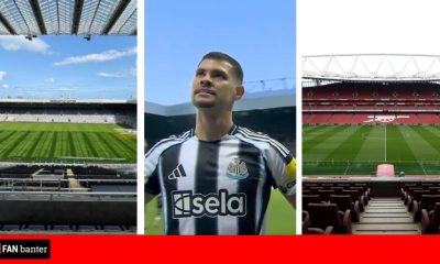
2) NEWCASTLE
talkSPORT said via their website: “The Geordie faithful got a tad carried away at the start of the summer, dreaming about getting ‘Mbappe 7’ on the back of their new kit after the proposed Saudi Arabian takeover.
“While that may not have happened, fans are still likely to flock to buy the new home shirt before the season opener against West Ham United.
“What makes this kit different from previous years is the effortless design of weaving the black and white stripes together whilst also keeping the collar and shoulders simple.”
1) BRIGHTON
talkSPORT said via their website: “By far and away the classiest kit in the Premier League this season, Brighton and Nike have got it bang on.
“The white pinstripes as opposed to thick blocks like normal are so aesthetically pleasing, but the simple white collar is what really makes this kit bang.
“Unlike plenty of Premier League rivals, the Seagulls manage to combine their primary sponsor seamlessly into their new kit and it just looks the business.”


You must be logged in to post a comment Login