The 2020/21 Championship home kits have been ranked from worst to best by ‘Footy.com‘, and once again, it’s got plenty of talk on social media.
At the time of giving their verdict, Bristol City and Blackburn were the only sides to not release a new strip, however since then, they have, so we will have a guess at where we think they would have been placed.
It’s been another summer of newly unveiled strips, however it seems the coronavirus pandemic has left the creatives at Adidas and Nike saying “fuck it, do what you want, no one’s arsed” it would seem.
It’s not to say there aren’t any decent ones about, but just which ones have been ranked the best of them all? Without further ado, why not check out what FOOTY writer Kevan Thorpe had to say…
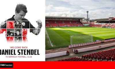
24) BARNSLEY
FOOTY.COM said via their website: When Wigan were docked 12 points and Barnsley survived by the skin of their hardy Yorkshire teeth, the club and its fans had cause to celebrate. It would seem their ecstasy didn’t translate into the new kit design.
Puma have had a real hit and miss year, and this is a classic bore-fest of red and white. White piping and a cut-off v-neck collar do nothing to add depth, throw in a sponsor which sounds as boring as it looks, and you’ve got yourself a bang average shirt. Let’s hope The Tykes can excite a little more than this effort on the pitch next season.
View this post on Instagram
23) CARDIFF
FOOTY.COM said via their website: This shirt contains nothing, only complete blueness (we get it, you tried the red thing and it didn’t work). The simplest of adidas templates hasn’t been built upon at all by Cardiff, their single choice was to add a plain white text nod to their chairman’s country of origin. Snooze.
This season they will once again be fighting for a return to the big time, but they most certainly won’t look good in the process.
View this post on Instagram
22) DERBY
FOOTY.COM said via their website: It’s quite often difficult to get excited about plain white kits. And Derby x Umbro have rolled another underwhelmer out for 2020/21. ‘Play Responsibly’ the betting sponsor cries, and the designers have gone as safe as Fort Knox on this. Spin it around and there’s another abyss of blankness, with the words ‘Derby County’ in grey on the neck. Think outside the box people!
The only redeeming factor is the outlined Ram badge, which is a classy touch. Let’s hope Wayne Rooney stays for another season to give the fans something to get excited about…
21) NOTT’M FOREST
FOOTY.COM said via their website: Macron has some cracking hits in this list, but like all hit-makers – they’ll release a dud every so often. There are two factors keeping this shirt away from the Barnsley-shaped prop at the bottom of the table: interesting cuff and collar combo with a previously unseen sponsor, Football Index – the fun footballer-based stock trading game.
Forest won’t want to miss out on the play-offs for another season, but they’ve narrowly avoided relegation in our countdown.
View this post on Instagram
20) BLACKBURN
FOOTY.COM said via their website: At the time of giving their verdict, Blackburn hadn’t yet released a new strip, however since then, they have, so we guessed at where we think they would have been placed.
We think that the new kit is rather smart. However the fans on social media don’t seem to be impressed at all with it, with the collar a talking point and not in a good way either.
View this post on Instagram? Introducing our new @umbro home shirt for the 2020-21 season! #WeAreTogether #Rovers ?⚪️
19) BRENTFORD
FOOTY.COM said via their website: We always say it, red and white stripes are difficult to work with, a theory proven by Umbro x Brentford here. They’re unlucky really, if we were talking about the away shirt then their black number would be catching our eye. Unfortunately, it’s home shirts we’re after and The Bees have had a mild stinker in that area.
Usually reliant on strong home form, they are going to need to play some incredibly dazzling stuff at the new Brentford Community Stadium to keep their fans aesthetically pleased during 2020/21.
View this post on Instagram
18) HUDDERSFIELD
FOOTY.COM said via their website: If red and white stripes are tough, blue and white are only ever so slightly easier. We’re not sure if The Terriers are waiting on a kit sponsor, but the lack of one here is what’s kept it up the list. An old-school look, keeping in tune with the club’s heritage badge. Thick stripes > thin ones.
There’s no doubt that Sir Patrick Stewart’s beloved team face another tough season, but who knows, they’ve done it once before against all odds? Leeds vs. Huddersfield in the Premier League, oof.
View this post on Instagram
17) ROTHERHAM
FOOTY.COM said via their website: A massive achievement from Rotherham to reach The Championship. Another Puma dud in contrast. We’re being a bit harsh, the white shoulder panels are a fresh feature, it has an inoffensive sponsor and the badge has impact due to its simplicity. Credit where it’s due, some thought has gone into the detailing with a criss-cross pattern throughout reading ‘The Millers’ in a traditional windmill shape.
It’s not quite as glitzy as New York, but we think they’ll sell a few in celebration of bringing Championship football to the New York Stadium.
View this post on Instagram
16) STOKE
FOOTY.COM said via their website: Macron have massively upped their kit game in recent years. Here, they’ve taken the difficult Potters’ pattern and made it reasonably interesting. The finer keylines around the bolder stripes work well, and we like the fact it stays consistent through the back, collar and hems. The cherry on the cake (the pot on the wheel?) is printed lyrics from Stoke’s unique song ‘We’ll Be With You’ on the inner neck.
Stoke City face another testing season in The Championship, we won’t be betting on them playing Premier League football at the Bet365 Stadium next year.
View this post on Instagram
15) LUTON
FOOTY.COM said via their website: The Hatters have not exactly turned ‘Mad Hatters’ with their latest effort, but they can rest in comfort that historically, orange kits just seem to work. Van Basten, Gullit, Davids… James Collins. The blue collar and reverse sleeve hems give the solid orange a lovely twist, JB Developments haven’t tried to dominate the shirt either. Tick.
With only just surviving this season, the Kenilworth Road faithful will be hoping that the players donning this outfit can turn in some stronger 2020/21 performances.
View this post on Instagram
14) QPR
FOOTY.COM said via their website: Macron have outdone Errea when working with the horizontal blue and whites this season, but this is a decent effort indeed. The retro collar and cuff combo is a lovely touch, linking well with the new-kid-on-the-block sponsor we mentioned earlier. Clean lines and smooth contrasts work well, it’s middle of the table safety with flashes of quality.
Loftus Road’s terraces will surely be lit up by this bright and breezy number, they’ll just be hoping the scoreboard does the same in their favour.
13) NORWICH
FOOTY.COM said via their website: Yes it’s yellow and green as always. They’re ‘The Canaries’ for goodness’ sake! Extra points here for the brilliant marketing release, a ‘Work Of Art’. The subsequent video and imagery all points to the finer details in the shirt, subtleties that may go unnoticed to the untrained eye. All of this happens amidst the soothing sounds of Mozart’s Symphony No.40. Delightful.
This Norwich side will be wanting to bounce back to the Premier League immediately, and dressed in this, their fans will be singing like, well… Canaries.
View this post on Instagram
12) SWANSEA
FOOTY.COM said via their website: Note to Derby: this is how you get creative with a white strip. Joma’s only entry on this list, but we think they’re a fantastic manufacturer and should be given more opportunities! The trippy gradient design on The Swans’ home shirt is unusual and original, which is what we like to see. The black piping helps to stop the white flushing everything else out.
They may not be happy with their position, but when Swansea fans see the state of Cardiff’s home kit, they’re going to enjoy it a little more.
11) PRESTON
FOOTY.COM said via their website: A pretty simple Nike template used well by another team in danger of a white washout. We’re a fan of a collared shirt, rarer in today’s game than they should be in our opinion. The contrast navy sleeves and red logo (we’re guessing that was the sponsor’s call) both add depth to simplicity. This is going to look sharp at Deepdale.
Championship stalwarts P.N.E. need to up their game if they’re going to push for promotion. It’s more likely though that they’ll match where they are in this FOOTY.COM table…
10) WYCOMBE
FOOTY.COM said via their website: Newly-promoted and off to a good start before the season even begins. The quadrant kit pattern is one which always interests us, and Wycombe x o’neills have done excellent work with it here. Rather than sticking with single dividing lines, they’ve used barcode-style detailing, which adds something truly unique. Dreams are the subtle sponsor, but this design won’t be sending us to sleep.
After a whirlwind few years in the club’s history, we’d guess the battle is on for The Chairboys to cement their place in The Championship this year. Beast Mode activated!
9) BIRMINGHAM
FOOTY.COM said via their website: That Nike template makes a return, this time with a few little touches to make us sit up. Classic collars and contrast sleeves are never a bad look, but The Blues have added an eye-catching geometric twist to the main body of this shirt, which has paid off massively. Sponsors that know their place and slot in seamlessly are a joy, BoyleSports have accepted their part gracefully.
This release is certainly worthy of the top flight, even with Premier League encounters at St. Andrews a distant memory for many faithful supporters.
8) SHEFFIELD WED
FOOTY.COM said via their website: Remember ‘The Dress’? Well, every time we look at this Wednesday number, we see something different. It’s somehow confusing, clever, ugly and beautiful all at the same time. Elev8 aren’t a brand you’ll have heard of, but they’ve burst on to the scene with clear intentions here. Subtle camo patterning runs throughout the blue and white stripes, whilst a retro contrast single button collar gives us nostalgic ‘90s feels. Let’s hope Sanderson return to sponsor them…
The Owl sits proudly on this chest, looking like a friendly Hogwarts’ house badge. OK, I think we’ve come to our conclusion: we really like it. Chris Waddle yourself down to the club shop, because these will go quickly.
7) BOURNEMOUTH
FOOTY.COM said via their website: Bournemouth were one of the first Premier League sides to unveil their new 2020/21 kit, kicking things off with a fairly strong start. The end of their season had somewhat opposite fortunes. The classic red and black stripes always look pretty strong, but this time Umbro have added a fantastic twist, with the impressive gradient effect freshening things up without ignoring the club’s traditions.
Let’s just hope they don’t replace Vitality (which works really well, by the way), with yet another betting sponsor. I won’t hold my breath.
6) MIDDLESBROUGH
FOOTY.COM said via their website: You’ll notice we’re big fans of the trend around nostalgia-inducing shirts. Stick this one on, smash one in and pull it over your head in Ravanelli-esque fashion. Hummel took Boro’s brief to celebrate 25 years at The Riverside Stadium and created a cracker, it even features the ground’s map coordinates embossed into the lower back. Nice touch.
Hummel stripes are always welcome in our book, couple them with a floppy collar and it’s a winner. Just make sure you get the right size, unlike Juninho in 1995/96.
5) READING
FOOTY.COM said via their website: Reading x Macron are definitely pulling inspiration from the World Cup winning France ‘98 shirt for us, most notably via the collar and sleeve detailing. Although, Zidane and Swift are not quite as closely matched. The easy on the eye Casumo scribble, bright horizontal striping and patterned shoulders all sit together to produce an excellent Royals shirt.
The back of the shirt stays all white, giving an effortless blend into the shorts and socks. It’s well above average, let’s hope Reading can do the same on the pitch this season.
4) BRISTOL CITY
FOOTY.COM said via their website: At the time of giving their verdict, Bristol City were the one of two sides to not release a new strip, however since then, they have, so we guessed at where we think they would have been placed.
The kit, made by hummel, has gone down very well online with Robins supporters. It’s been described by Twitter users as smart, stylish and worth the wait.
3) COVENTRY
FOOTY.COM said via their website: Another Hummel beauty! This brand has been making a phenomenal comeback in 2020/21 and coupled with a club that regularly churns out top class designs, it was only going to have one outcome. A throwback from the earliest Premier League era Coventry kit, that distinctive design is effortlessly graduated into a more modern style throughout the front. We reckon Micky Quinn and Phil Babb would proudly wear this one today.
The Sky Blues are new to Championship football, but they’ll be looking for another strong season as they push to return to the top flight for the first time in over 20 years.
2) MILLWALL
FOOTY.COM said via their website: Macron, we love you this season. Yes, we said it. This shirt is incredible, pure ‘what goes around comes around’ gear. It’s more ‘80s than Duran Duran, and you wouldn’t be surprised to see hipsters combing their beards, rolling up their pants and heading into Shoreditch for a vegan flat white in one. Likewise, The ‘Wall’s faithful will certainly look the part on the terraces this season.
The shirt’s white trimmings and subtle diagonal pattern are perfect. I’m off to grab the Huski Chocolates for the office, do you want one?
1) WATFORD
FOOTY.COM said via their website: Kelme, from nowhere! Hornets fans were worried when the club announced they’d be leaving adidas at the end of a drab Premier League season. What was there to worry about? Reminiscent of legendary Kaizer Chiefs’ home strips, this burst of sunshine will cheer up the followers and help them to forgive and forget. To avoid being too overbearing, the contrast shoulders are black with grey and yellow detailing
Yes, this one will probably divide opinion. For us, they’ve taken a bold risk and it’s paid off. Can they do the same this season and make a quick bounce back?


You must be logged in to post a comment Login