Newcastle United fans have their say as three proposed new crest designs are revealed with emails sent out to cast their vote.
Newcastle United Supporters’ Club (@NUSCuk) state that supporters can pick their top two choices in a poll which will close on 27th August at 12pm with the winning design considered by the club for adoption.
But it seems since these options have emerged, fans are expressing disappointment and have instead expressed preference for a retro crest.
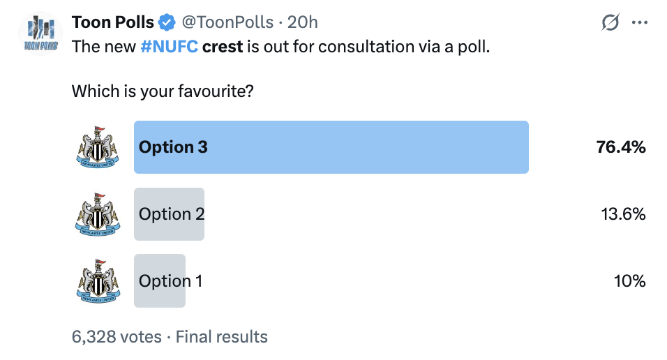
The three proposed new crest designs have been revealed, and supporters are now receiving emails to cast their vote.
What do you make of them? #NUFC pic.twitter.com/8oBpG3djin
— NUFC Blog (@NUFCBlogcouk) August 7, 2026
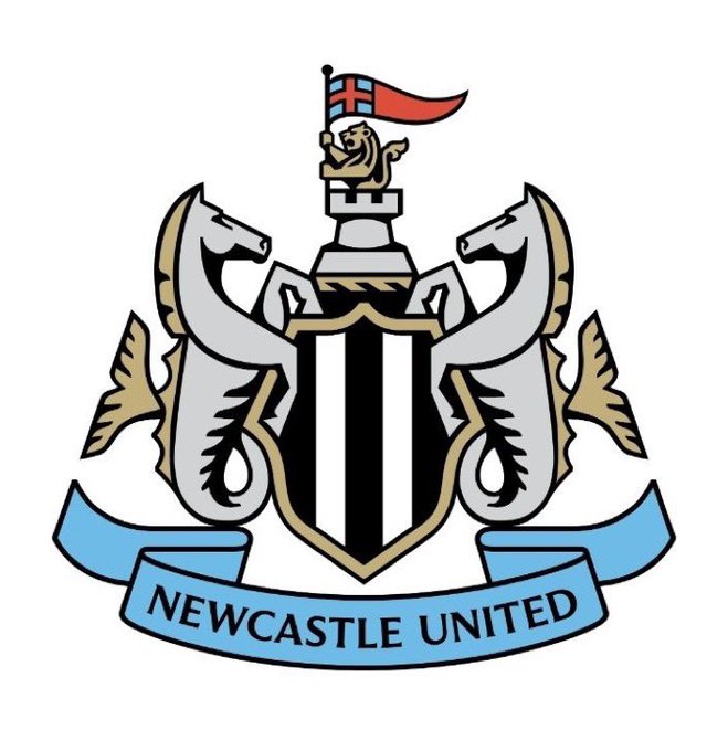
Option One
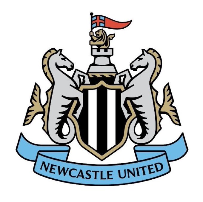
Option Two
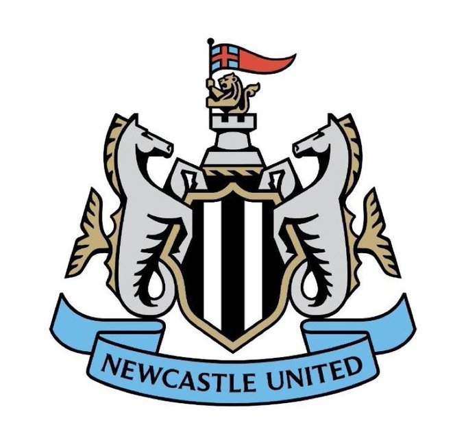
Option Three
Basically the exact same energy as this leaked montrosity from over a year ago. pic.twitter.com/DrkMsgEo9j
— Vocal Hero (@TheVocalHero) August 7, 2026
Said in a video sent out by the club: “Our modern football brand must be distinctive, meaningful and capable of expressing itself clearly wherever it appears. Our authenticity is our greatest strength, the clearest expression of who we are.
“Yet our crest is not always seen as clearly, consistently or confidently as it deserves to be.
“An opinion shared by trusted partners and industry experts across both brand and sport.
“The feedback was clear.
“While the club continues to move forward, its visual identity is struggling to keep pace.
“The result is a crest and brand that is harder to recognise, harder to use, and harder to champion around the world.
“This is about more than perception. It’s about pride. It’s about performance. It’s about competing at the highest level.
“To do that, we must refine how we communicate and present ourselves. That means clarifying what makes us unique, sharpening our story, expressing it with confidence, consistency and craft.
“Every detail considered, built for the future, rooted in respect.
It continued: “Crests its heart of who we are and centre to our identity. Like you, our supporters, we love it.
“That’s why it deserves to be represented at its very best. More than a badge, it is a symbol of our city, a mark of belonging passed through generations.
“Born from Newcastle’s coat of arms, it carries the spirit of the city and the story of our club. Shaped by history, refined over time, evolving yet unmistakably ours. And while its form may change, its meaning never will.
“Trends and fleeting moments, two crests have defined Newcastle United. Together they carry more than a century of history, worn by generations, etched into memory, made iconic by legends. Harvey, Milburn, Macdonald, Moncur, Shearer, Burn.
“Introduced in 1988, our current crest draws directly from the city’s historic coat of arms. The castle, the seahorses, the shield, symbols that have represented Newcastle for centuries.
“Long before 1988, this same heritage traveled the world, worn in triumph throughout the 1950s and on legendary nights in Budapest. Different eras, different designs, one identity, carried by its people and passed through generations.
“From the beginning our aim was clear. Respect our identity, refine what we cherish, strengthen the club for the modern world. Elegant, flexible, modern, meaningful. Create something we can all be proud of.
“We began reviewing the history of our crest. Across four primary iterations, two stood apart. Both were rooted in the city arms, visually distinct, yet meaningfully aligned.
“We saw strength in both and believed that through careful refinement, they could better tell our story. But we wanted to hear what you thought.
“Your voice confirmed our thinking. The message was clear. You love what we have, but understand the issues. I wish to preserve our symbols and respect our heritage. The castle is essential. No circle. No change for the sake of change.
“There is a shared understanding. Complexity is holding the crest back. Some simplification and refinement are needed, but the identity must remain.
“Supporter engagement made the direction clear. Protect what matters, refine with care, simplify where necessary, bring clarity to modern world.
“The fundamentals are non-negotiable. The castle, the seahorses, the shield, the club name. These are not design elements, these are symbols of heritage.
“So the challenge was clear. Evolve, not reinvent. Protect identity whilst enabling growth. Refine without losing authenticity. Honour the past. Create pride. Build for the future with respect.
“From these constraints we went to work. We explored widely into unconventional territory across bold unexpected ideas back to more familiar ground.
“Some ideas were discarded others were refined relentlessly. A few became the foundations of stronger thinking. Some sparked conversation far beyond the club.
“Every route taught us something. Every iteration brought us closer. At the heart of the work were three guiding principles.
“Respect, honouring our heritage and safeguarding the values, symbols and traditions that define us.
“Detail, obsessing over the margins where every line, decision and refinement serves a purpose. Future, creating a modern, distinctive and enduring crest and brand, one built to compete with confidence and pride on the global stage.
“Through iteration and renewed connection with the city’s coat of arms, we uncovered deeper meaning within every element. Individually distinct, collectively stronger.
“We were drawn to a simple idea, not choosing between the past but bringing its strongest parts together.
“As in 1976, 1983 and 1988, the time has come to evolve, not to change who we are, but to protect what we cherish. The challenge is not what to keep, but how to carry it forward.
“The seahorses are guardians of Newcastle’s maritime soul. Creatures of tide and terrain, move with strength and purpose. Their story is older than memory. Rooted in myth and ancient oceans where Roman sailors looked Neptune and Oceanus for protection on restless seas. Newcastle seahorses are symbols of courage. They remind us the sea was never a boundary. It was a calling. An open horizon. An invitation for a city born of innovation to look beyond.
“The shield, the foundation of Newcastle, a symbol of resilience strength and unity, from the ornate city inspired forms worn by Milburn and his generations to four decades in black and white stripes, constant through every chapter of our story.
“Castle, permanence, pride and place. Castle thy name, resilient by nature. The lion and flag, symbols of strength, courage and determination. A city that never backs down.
“The ribbon, Newcastle United, forward in 1892 to United City, East and West, one club, one people, a symbol of belonging. Together we are always brave and strong.
“Every generation inherits a responsibility to preserve what matters and prepare it for what comes next. The crest has evolved before, it will evolve again, but its purpose remains unchanged to represent Newcastle.
“Its history, its people, its ambition, more than a crest, is our identity. Every element refined, individually and collectively, with respect for the past and clarity for the future. This is what they represent. This is how they come together. This is Newcastle United Football Club.”
Newcastle United fans have their say as three proposed new crest designs are revealed…
@1892tb: Dread to think how much someone’s been paid to produce those
@Mark74NUFC: Is this not just a game of spot the difference??
@PeterWright180: What were people expecting that said no to a circular badge? This is literally the only option they had given the feedback
@AlCraig90: Give me the away kit badge over this every time
@kainnufc: Honestly couldn’t believe it when I saw these 3 options after all that repetitive spiel in the 8 minute video. A waste of everyone’s time and apparent research to just end up making the existing badge more squared off and clunky looking.
@southwalesmag: Apart from the minor changes on the seahorses I can’t see any differences between any of them…
@FI_360: I’d rather a new badge entirely, or revert to an older version than butcher the current one. Not a fan of options either side with sergeant seahorses. Middle is the only one to consider and it still needs a good clean up. #NUFC
@northumbriana: Most of the chat has been about the seahorses/hippocampi, but the lion in the castle is now much better. But they have missed a trick not changing the pennant to the 🏴 as in the city arms. (There are a few theories but no one really knows why the club’s version is red and blue.)
@NUDMC91: Really don’t get the level of outrage on this. We asked for them not to change much. The middle one looks close to the current design just a bit simplified/uglier. Feel like we could get used to it and it be ok, might just take time. Better than the old circle badges still.
@josh_w_1892: Jesus christ. If they’re the options, what a humongous waste of time. I understand it’s simplified from the current badge, but is it simplified enough to justify the reasons for changing it in the first place?
All of these are awful. Give us this pic.twitter.com/dOXP7ELKQh
— what (@FuhhQueue) August 7, 2026
After a massive prompt and several revisions, I’ve had AI create something which I prefer to all three. It’s more inkeeping with existing crest, and it a tidied version. #nufc pic.twitter.com/jWBJ3VJK2M
— GC (@NUFCgc) August 7, 2026
All it needed was some detailing reduced inside the crest
The shape is absolutely fine as it is pic.twitter.com/QmpIsKgikX
— Nathan ☾ (@eagerrnj) August 7, 2026
All actual awful imo, I’d genuinely rather them go back to this than ruin my memory of our current badge. https://t.co/Z4EXWtmS4V pic.twitter.com/q3Fhz1lXh6
— Lewis Bowden (@LewisBowden_) August 7, 2026






You must be logged in to post a comment Login