Time to take a look at the latest new kits revealed by Premier League, EFL and National League clubs for 2025/26, as of June 20th.
The 2024/25 campaign is over and done with, so now their attention can only turn to the next one, and with clubs still needing cash to boost their finances to make up for the last few seasons, now is the perfect time to release them to supporters.
There have been a number of incredibly unique shirts come out this summer with all kinds of patterns, shapes, gradients, colours and we’ve even floral designs.
Over the last few weeks, we’ve seen a variety of kits, some rather nice, others rather underwhelming. Take a look at them further down in the article…
GRIMSBY HOME
@LloydGriffith: This town sure has some talent. Well done to Luke (on the shirts) & James (on the video). Ace. Also, great that we have four local companies sponsoring elements of the kit – putting back in to the town. I know some people don’t like mottos, but we truly are greater together #gtfc
@MikeyMcMahon: I’ll put this in simple terms… I absolutely fucking love everything about this! #gtfc
@Grimsby1878: I… I don’t think I like it. The MyEnergi is too thin for the thick red band
@steelmariner: Kits will always be subjective, but regardless of your opinion on the design, the message and the video behind it is 👌#GTFC
@GarethDrakes1: Real thought gone into this. A kit with a community feel with all the local sponsors, an homage to one of our most succesful seasons and great promo vid featuring Grimsby born and proud by The Twist. Whats not to like! #GTFC
@jaseives: You’ll never please everyone regardless what you come up with – think it looks good personally, great work with the video. 👏 (bet it doesn’t itch like the original..)
@cragsywoods: I quite like that. Always think the red goes well with the black and white to inject a bit of colour!
@ledwidgejack1: not a fan, but if we get promoted in it i wont give a fuck
The spirit of ‘98. ⚪️⚫️
Introducing our @umbro home shirt for 2025-26.
Full launch details coming soon.#GTFC pic.twitter.com/ST9eNZ7J0T
— Grimsby Town F.C. (@officialgtfc) June 10, 2025
FLEETWOOD HOME
@ollieroge: Collars make it so much better very good kit
@JackStockell07: That’s gorgeous. The collar makes it look so much nicer
@TylerDodd2002: A thing of beauty 🤤
@hendocfc: Another surprisingly good design from Puma for an EFL club
@knewshh: Best home shirt in years
View this post on Instagram
PETERBOROUGH HOME
@KPVFC10: Ok. Puma have holy cooked this year 🙏 Another beauty of a shirt 🤤 #PUFC #EFL
@Bowie_666: The sponsor ruins it!!!!
@E_Sure91: Fifty two pounds sterling 😳 #pufc
@1934JB: I’m sorry that is vile
@ffsTeekay: Can’t be just me that doesn’t like it… not a big fan
@Gameday523: Don’t mind that kit at all. #pufc
View this post on Instagram
MAN UTD HOME
@UnitedRadar: Beautiful kit
@mufcredrealist: I can’t wait to buy but how long will I have to wait until Glazers leave? I’m not giving them scumbags a penny #GlazersOut
@smarven07: All the same message #GlazersAndRatcliffeOut
@animerch_x: Next time, get the fans submit designs. Lots of talented designer. Give the winner a jersey or something. This design looks pretty much the same
@J_Credo_: £120 smackers for a football shirt. Worlds gone fucking mad.
@FergiesRightRef: The kit is good. Slick and classy.
View this post on Instagram
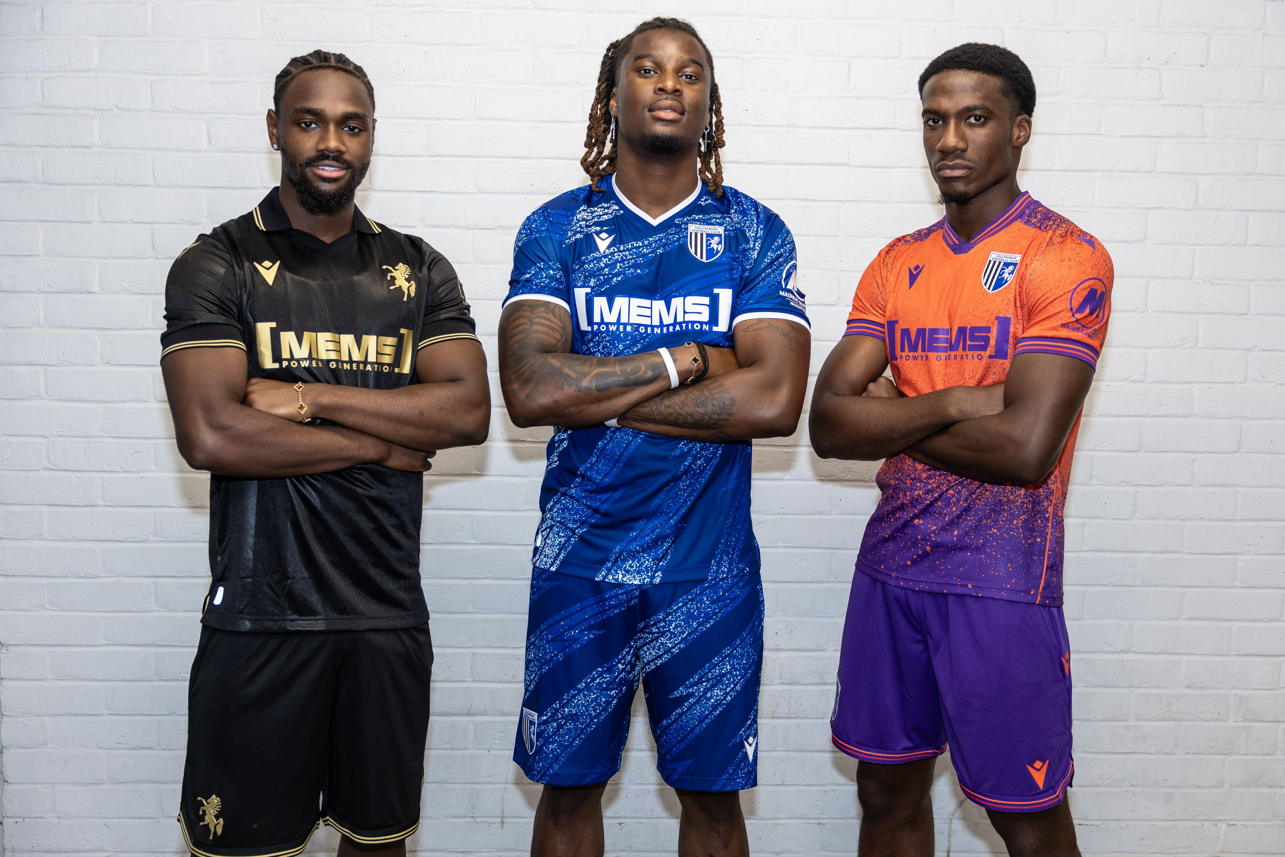
GILLINGHAM KITS
@CouncillorPaige: Am going for the black and orange versions – wished the blue shirt retained white sleeves with white shorts, so a no sale for me for the latter. But a good effort, though. 🔵⚪️🔵⚪️🔵
@mike_gammon: Some of the responses to the kit have been amusing. “It should be blue home, white away, yellow 3rd” and “It should be the same badge for all kits” being particular highlights Meanwhile, your other half is looking at you thinking she could do with a bit more adventure 😂 #gills
@mikeywoods89: You can guarantee if we only ever used those colours, the same people would be complaining that our kits look the same every year 😂
@Cliffinkent: Just take all of my money. Thanks Gillingham 🤣
@PottsWarre11780: #Gills black and gold is a beautiful kit
@MichaelNormNorm: £100 is leaving my bank account today in return for the new kits 🤩
DOVER KITS
@DAFC_Connor: @VX3apparel have done it again. They keep producing bangers after bangers. Love both but that away kit 🔥🔥
@aaronbrading: 100% getting that away kit. What a stunner
@steveysey: Home kit nice clean look, away 🔥, club social media 🐐
@morgscott9: Some away shirt that 🤩
@owooldy23: Absolutely banging away shirt 😍
@ChuckyShed: Really like the away kit.
View this post on Instagram
BLACKBURN HOME
@TJTykeo: Don’t get me wrong it’s a nice shirt. But this is the 150th anniversary. Look at Port Vale’s new shirt and then look at this. Built up as something special just to be similar to last year. Even if they release a limited anniversary special, should have been our kit all seaso
@Phil_Comley: I love Rovers home shirts, the blue and white halves are a timeless classic. However given the significance of this season that’s been highlighted so much, this shirt is slightly underwhelming; a real shame
@Josh13589425: Expecting a limited edition kit or something.
@TheSp0rtGuy: Our ‘fans’ are pathetic. The new home kit is underwhelming, yes, but it is a bloody beautiful kit. They will likely have a special one off kit or a special third. Half of you don’t bother turning up anyway so I doubt you bother to buy the kit no matter what it looks like.
View this post on Instagram
CHARLTON HOME
@AuthenticomLtd: A solid effort. Can you imagine how good the next one will be if @Reebok take up the offer from @CHATHMuseum on having a fans consultation like Hummel
@cafckits: Supposedly introducing our home ‘kit’ yet there’s no sight of the shorts or socks. Maybe I’m showing my age(!) but it would be great if shirts were launched with the whole kit so we could see it in full… #cafc
@flud_j: Now we know why reebok haven’t done a football kit in years 🤢
@platty82639487: Fair play getting announced so soon ! AND product available ! So much money lost last year towards season end with no products to buy… It’s red and white – main thing!! Not bothered about the black cuffs like some – looks cool – does the job 👍👍 #cafc
@freeCAFC: I like it, little bit different to recent years but I think it’s a strong effort #cafc
@getupcousinjim: Black band on sleeves looks pony
View this post on Instagram
CAMBRIDGE HOME
Cambridge United unveil incredible kit launch video with new crest and familiar faces
SHREWSBURY HOME
@castledavo: That kit, Gary Hackett, Gay Meadow 😍
@Evsbech1: Last season was awful but this season is off to a good start with the couple of decent signings and the new kit.
@TheLeftyScot: Huge fan of this shirt! Shorts are a little bit much for me, I think it overdoes the amber somewhat, but I said that about last year’s kit and it grew on me fairly quickly. Slightly late to the game this year, but Oxen have done a stellar job again! #Salop
@KatieEdwards_11: Very niceeee 🔥 Wish the shorts were blue instead of that amber colour. Other than that it a beauty.
@Cam3Evans: It’s a beauty! League 2 champions winning shirt 🔷🔶
@RuytonShrew: The best kit we’ve had in many years. Hope we have a team worthy of wearing it! #Salop
@TomGriffBC: I’ve given the club a lot of shit in the last few months but my god they’ve smashed this out of the park. What a shirt. 😍
View this post on Instagram
READING HOME
Reading unveil new 2025/26 home kit with unique design dividing fans on social media
ALDERSHOT HOME
@comeonshots: Granted its not the traditional red and blue stripes, however obviously no ones noticed the blue spirals are the Feathers of the Phoenix, still a nice Shirt 🔴🔵
@Jacob_Welch00: How many pints deep on the 11th May was the bloke who designed this when he sent it off?
@LeviDarch: 🤨 I’m sure it’ll grow on me
@hendocfc: Wonder if these swirls are meant to be something or designer thought they “looked nice”
View this post on Instagram
Latest new kits revealed by Premier League, EFL and National League clubs for 2025/26 – 9th June


You must be logged in to post a comment Login