Fans have took to social media with a plea for 9th tier club Sheffield FC to have a rethink after getting rid of a much loved crest
The world’s first football club, who play in the United Counties League Premier Division North, have gone for a new look, but the reaction isn’t what they had hoped for.
Gone is the unique shield design, and instead, Sheffield FC have gone with a circle template, and well… see for yourselves below!
Our history is unmatched, but we’ve never stood still.
Sheffield FC has worn many badges since 1857. Our new crest marks the next chapter, inspired by our unique status as holders of FIFA’s Order of Merit and the gold medal awarded in recognition of our place in football history pic.twitter.com/36rtt68o7P
— Sheffield Football Club (@sheffieldfc) June 30, 2026
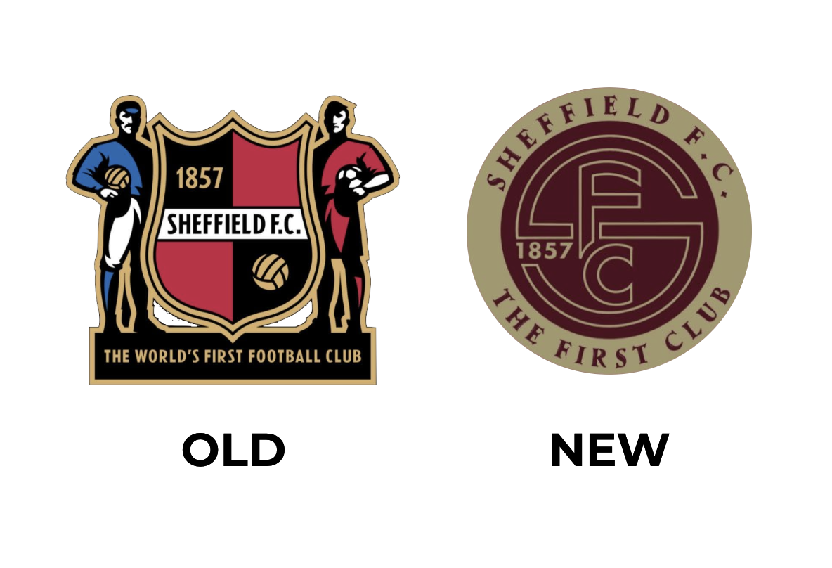
Sheffield FC said via social media: “Our history is unmatched, but we’ve never stood still.
“Sheffield FC has worn many badges since 1857.
“Our new crest marks the next chapter, inspired by our unique status as holders of FIFA’s Order of Merit and the gold medal awarded in recognition of our place in football history.
“Honouring our past. Building our future.”
Jon McClure reveals plans to transform Sheffield FC after becoming their new chairman
As mentioned, fans plea for the 9th tier club to have a rethink after getting rid of their much loved crest…
@BCAFCBH: That’s probably the worst badge change I’ve ever seen, should be the same reaction to that Leeds one that lasted 24 hours
@Panchero: Surely you have to rethink this. Can’t imagine what was going through the heads of the people who approved it. Huge own goal
@stvnhncck: That is absolutely awful. Your USP is your position in the history of football so this modern design of the badge is unnecessary. Focus on finding a ground in the City of Sheffield!
@cologinokeel: Naa you can sack right off that’s horrific. This club prides itself on standing out as the first football club, and is now following the trend of many other clubs moving away from its iconic and unique badge and towards these boring circles that all look the same. #SheffieldFC
@gelderdend_com: That’s awful 😞
@sneakunique: The most recent badge was incredible. Loved it. Not jumping on a bandwagon here but this is not a step forward at all. Have a proper think before implementation.
@mungerville: That’s a shocker. Badly designed, muted colours that work against each other and cluttered with no real focal point. From a technical point of view it’s also very poorly executed with spacing and curves all over the place.
@Briggsy1867: Terrible decision, changing the badge is bad enough but having people look at and think “yup that’s the one”. I think a trip to @Specsavers is required!
@FMTreq: Why on earth would the club think re-branding the world’s first clubs badge with all the clubs history and tradition is not only a good idea but a top priority with the new owners. Absolutely clueless.
@M_Eggy1: Have you ever seen such a monumental disaster of an updated club crest? Only one man to blame for it all really. Wouldn’t surprise me if his brother had something to do with it too.
@GallacherSteve: Sorry others were spot on oldest club etc etc This is awful absolutely nothing to do with the history etc
@Aimerdee: Nothing of the past. No heritage. No culture. No pride. No representation of the city you’re trying to represent. You built a brand, previously, but now you’ve just burned that down to the ground. Shocking.
@StevieG0v0: Hhhhmmm no. I’m with the majority on this one. Didn’t need ch ch changing. If anything a remake of the 1957 badge would have been perfect. Maybe you should reconsider for the 170th anniversary season
@kickassduke: Yeah, this is a downgrade. Hate to say it, but it doesn’t look anywhere near as good as your current one. The monogram is very untidy and doesn’t stand out as it’s outlined rather than solid. No clue what that font is round the outside, but it looks all over the place
@toffee_tower: ‘Honouring our past’ by removing all the character about it and creating a dull circular badge like so many other clubs. At least stay original. Poor this.
@LeniHob:
Yeah sorry. That’s a poor downgrade.
Literally all of the ones in that montage are way better.
Really need a rethink on this one folks.
@BibleBaggins46: What in heavens name have you done
@Nathan94Matthew: Oldest club in football, now unidentifiable from half of the clubs in the country. These boring circle badges are horrendous
@JakePetrolhead: Had a feeling a rebrand would happen with the new Chairman, it’s just a shame it’s a painfully generic circle badge for a club whose uniqueness is unmatched. I’m sure given time, it’ll be part of The Club. But right now, it could be any Non-League team’s badge beginning with S.
@FightingTarq: This has gone well. Surely you’d get the fans involved in a change so big when you’re coming in.
@_WestHamReport: I mean if it’s not broken don’t fix it… God this is such a backfire


You must be logged in to post a comment Login