Cambridge United this unveil their brand new club crest following a fan vote with a new video featuring Dion Dublin posted online.
Well it was coming, whether fans wanted a new one or not, the U’s have revealed the winning choice picked by supporters.
Many urged the club not to change it, and still do to this day, years ago, Cambridge unveiled a new design which didn’t go down very well at all.
They saw the backlash, so decided not to go with it after all. Only to then put together a new set of proposed crests, three for fans to vote on, while there was no option to keep the current one.
The video of the winning choice this week has received praise from the fanbase, supporters saying they loved the transparency of the results.
They added that the new crest looked better with Cambridge United underneath, while also loving the other symbols and icons as seen in the video below…
Evolving our Identity, feat. Dion Dublin 💛🖤 pic.twitter.com/azExwOO8Ao
— Cambridge United FC (@CambridgeUtdFC) October 30, 2024
Following an 18-month process and in-depth consultation period, we are pleased to reveal our new Club Identity.
— Cambridge United FC (@CambridgeUtdFC) October 30, 2024
Evolving our Identity
Over the past 18 months, we have been on a journey to create and evolve our identity seeking to ensure we protect our history and heritage, whilst developing an identity fit for today’s modern world and representative of our aspirations. Fan engagement has been at the heart of this and we revisited the process after fan feedback last year.
Our Owners and Board see this as an important part of the ongoing modernisation project for the Club which looks to the future whilst respecting the past. The primary purpose is to help drive engagement and income, which can then be invested in the playing budget.
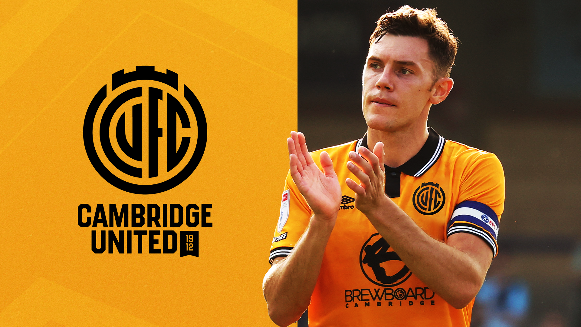
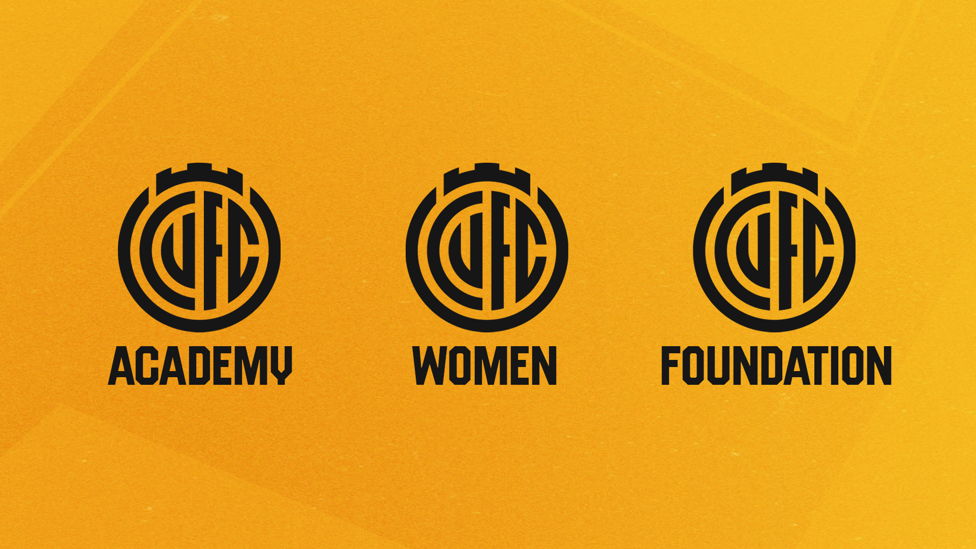
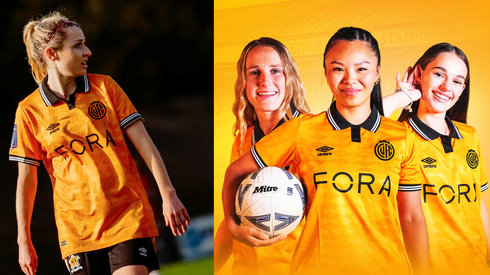
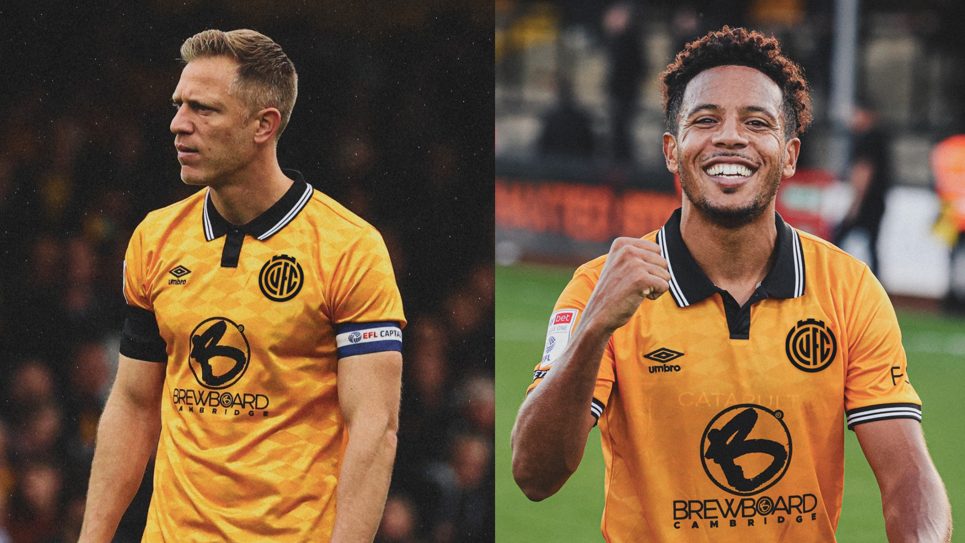
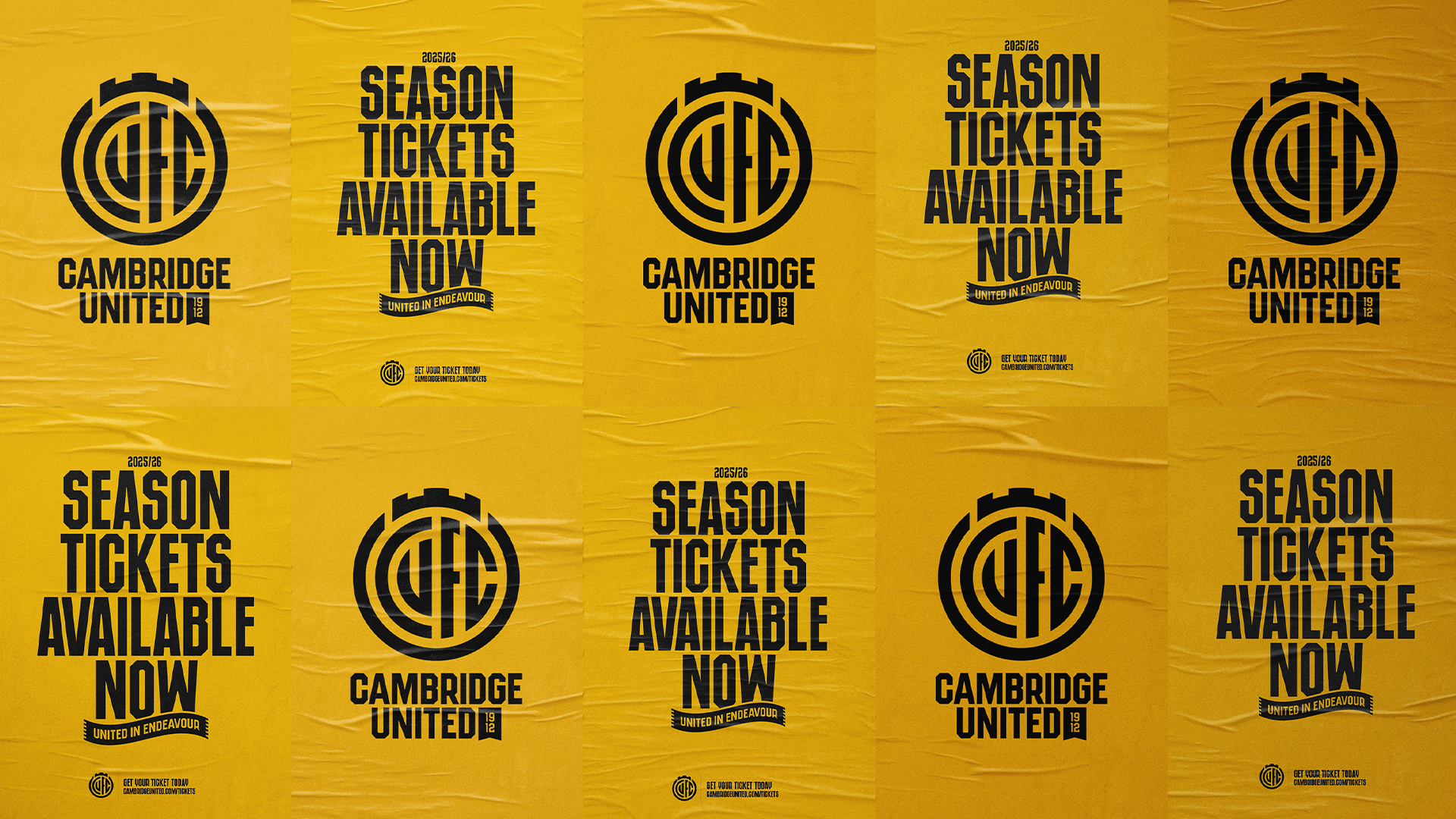
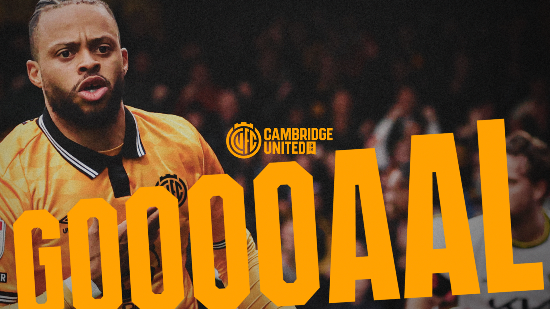
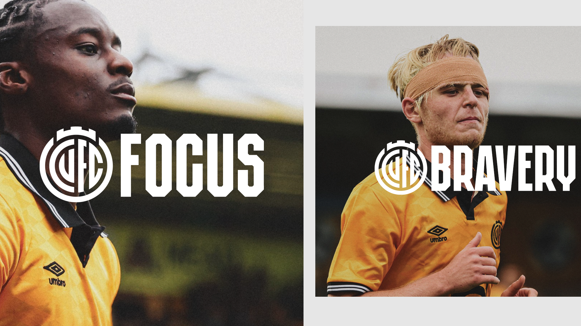
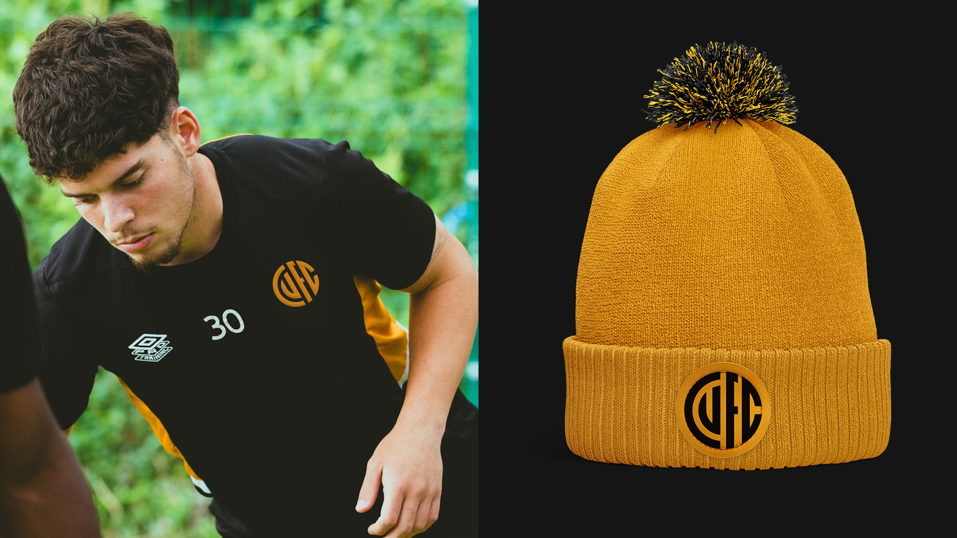
We are now pleased to reveal our new Club identity – which includes a primary Crest, in addition to a set of Secondary Identities that reflect different parts of the Club and our City.
The new identity will be used from June 2025 and has received full endorsement from the Shadow Board, who have helped guide and support the Club throughout the process.
A month of consultation
Throughout the summer, we developed new concepts and asked for feedback on three different designs.
Direction One – Evolution – A modern evolution of previous crests
Direction Two – Abbey Inspired – Inspired by the Abbey and architecture of Cambridge
Direction Three – Book & Ball – Influenced by the Book and Ball identity from our past
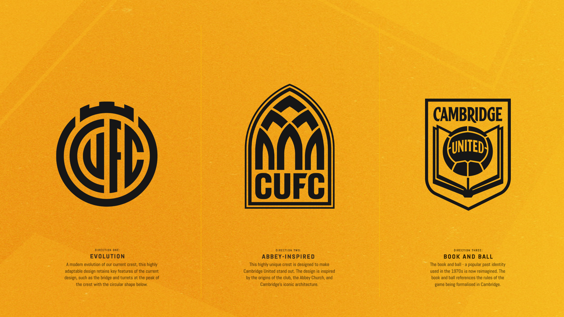
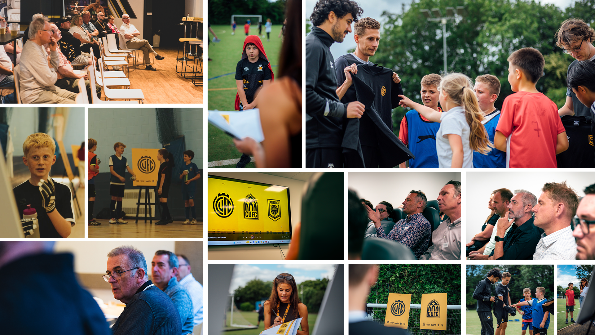
Following the release of the three designs, we embarked on a month of feedback and consultation with a wide variety of stakeholders, of all ages and demographics. We held in person events which engaged players, commercial partners, Foundation participants, staff members, and most importantly, the Amber Army.
At the end of the consultation period, we also released an online survey, allowing everyone to share their feedback. We received a strong response, with over 2,500 Cambridge United fans participating in the survey.
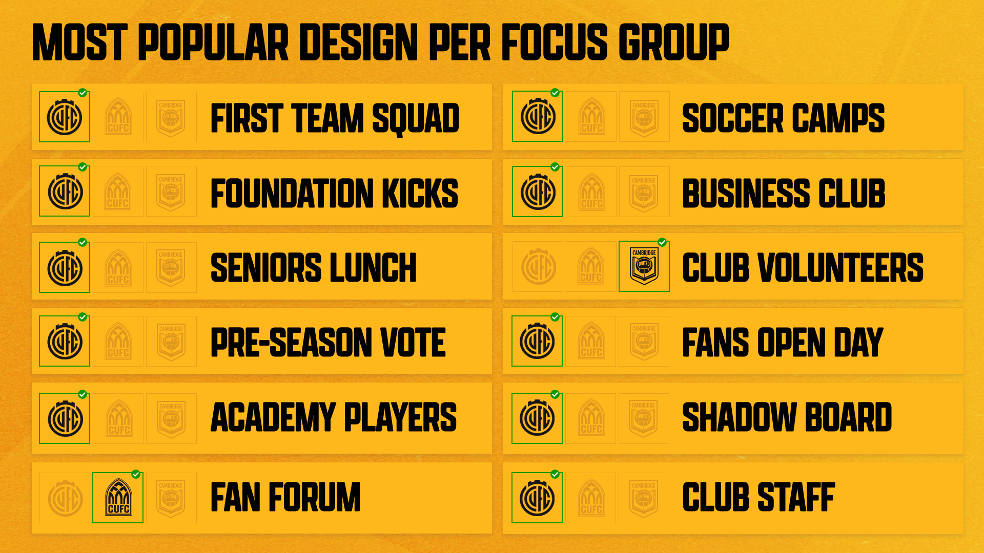
In-person events
In the in-person events, Direction One, Evolution – was an overwhelming favourite and received the highest vote share in 10/12 feedback sessions.
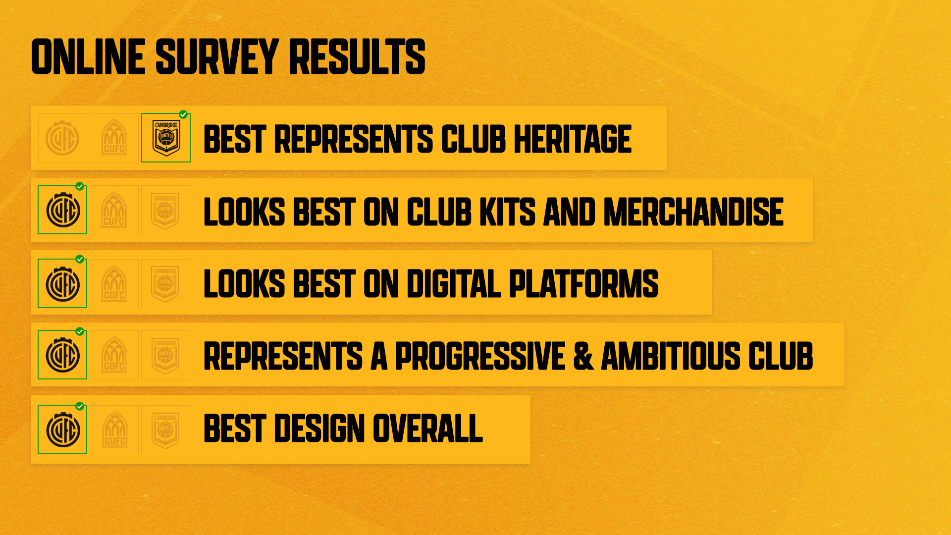
Online Survey
The results of the online survey followed the same pattern. Direction One – Evolution received the most votes in four out of the five categories, including ‘Best Design Overall’.
The chosen design
We are pleased to confirm that Direction One – Evolution has been selected as our new Primary Identity.
The feedback from supporters and stakeholders clearly indicated that this was the most popular choice, and the design particularly resonated with young fans – the future of our Club.
Design amendments based upon fan feedback
After analysing the thousands of comments that accompanied the survey results, supporters suggested that whilst they liked Direction One – Evolution, the design should include the Club’s name.
We have taken this feedback onboard and are pleased to be including this in our official crest. We have also made some minor adjustments to the shape and spacing of the outline which makes up the design.
The version without the full name will still be used, however, the main version of the Crest will include ‘Cambridge United’.
It is designed to be flexible and adaptive – allowing us to pair it with various wordmarks, depending on the function or use.
Sub-identities
Whilst this project was about updating the Club’s Crest, it was also about creating a wider identity that captures the history and heritage of our great Club and City.
During the consultation process, we also asked for feedback on a selection of icons that will be used to represent the Football Club in various ways.
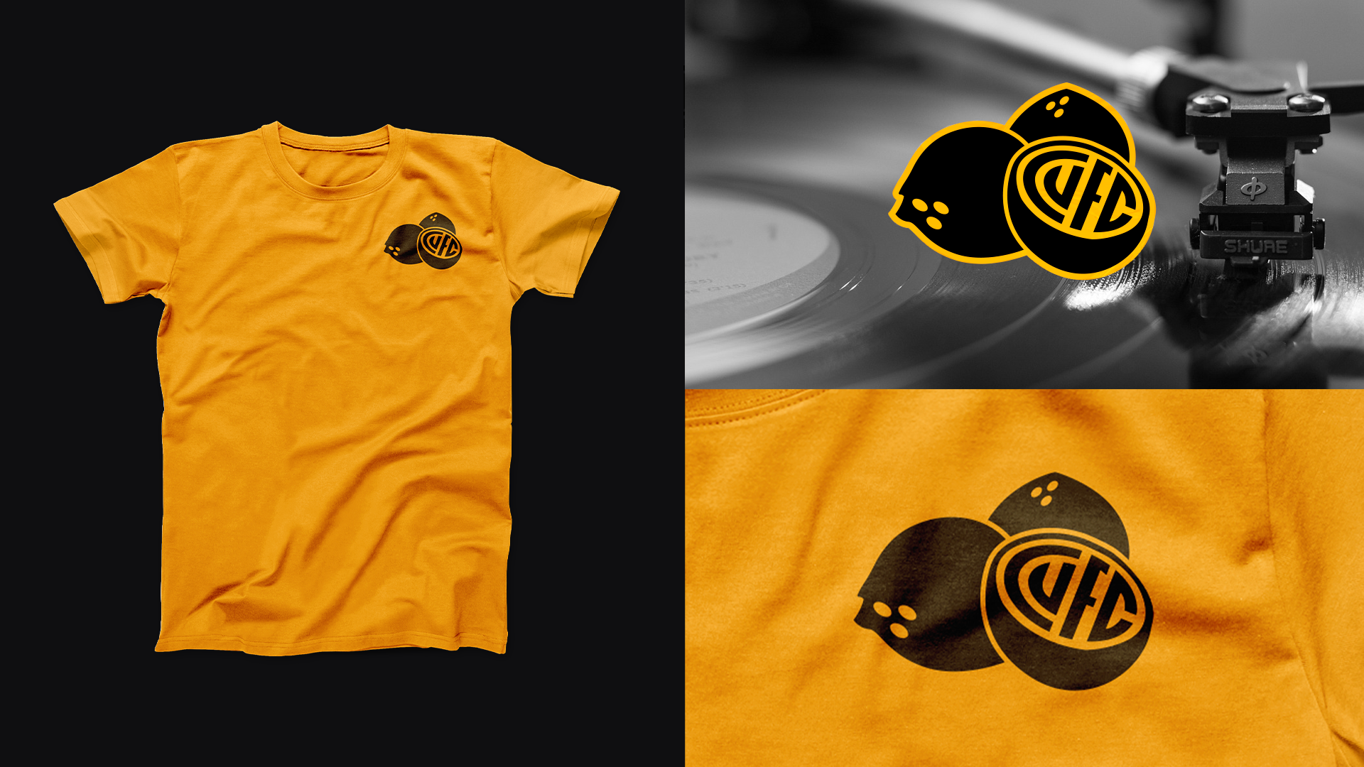
Not only did you vote for your favourites, but you also suggested that we create a ‘Coconuts’ identity, to represent our famous Victory Anthem. We are pleased to be including this in our final line up of sub-identities.
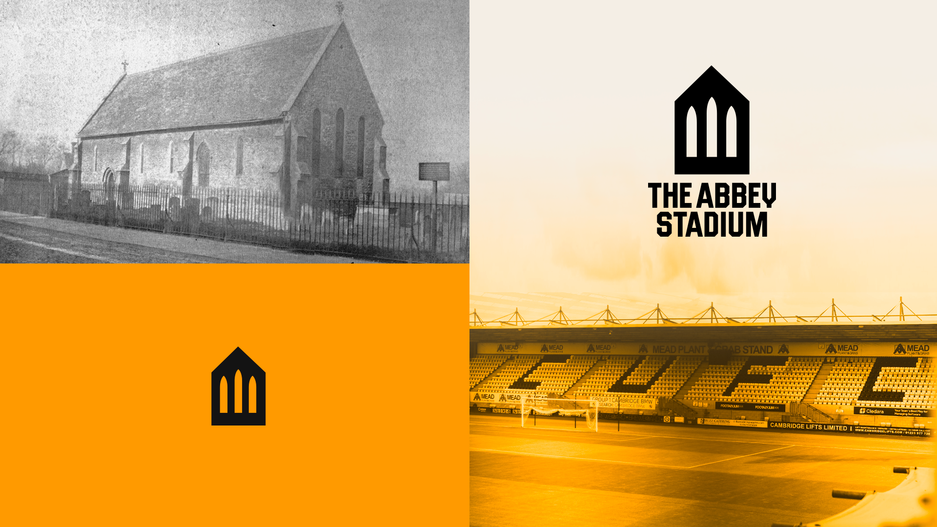
We have also introduced a new Abbey Stadium icon, and included the Book and Ball from Direction Two.
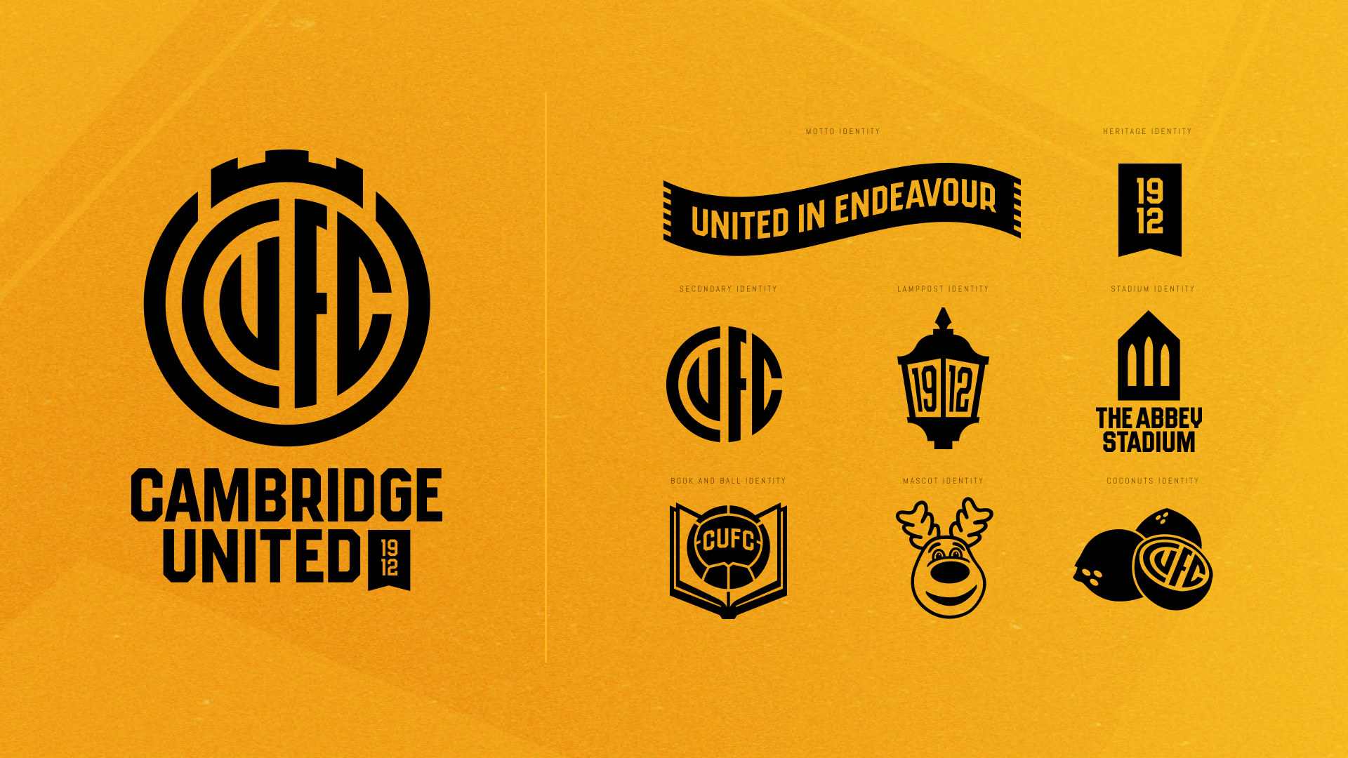
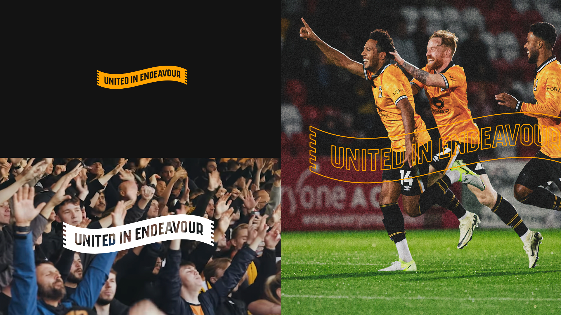
United In Endeavour Scarf – Our motto is carried in a scarf to represent the club’s unity with its supporters
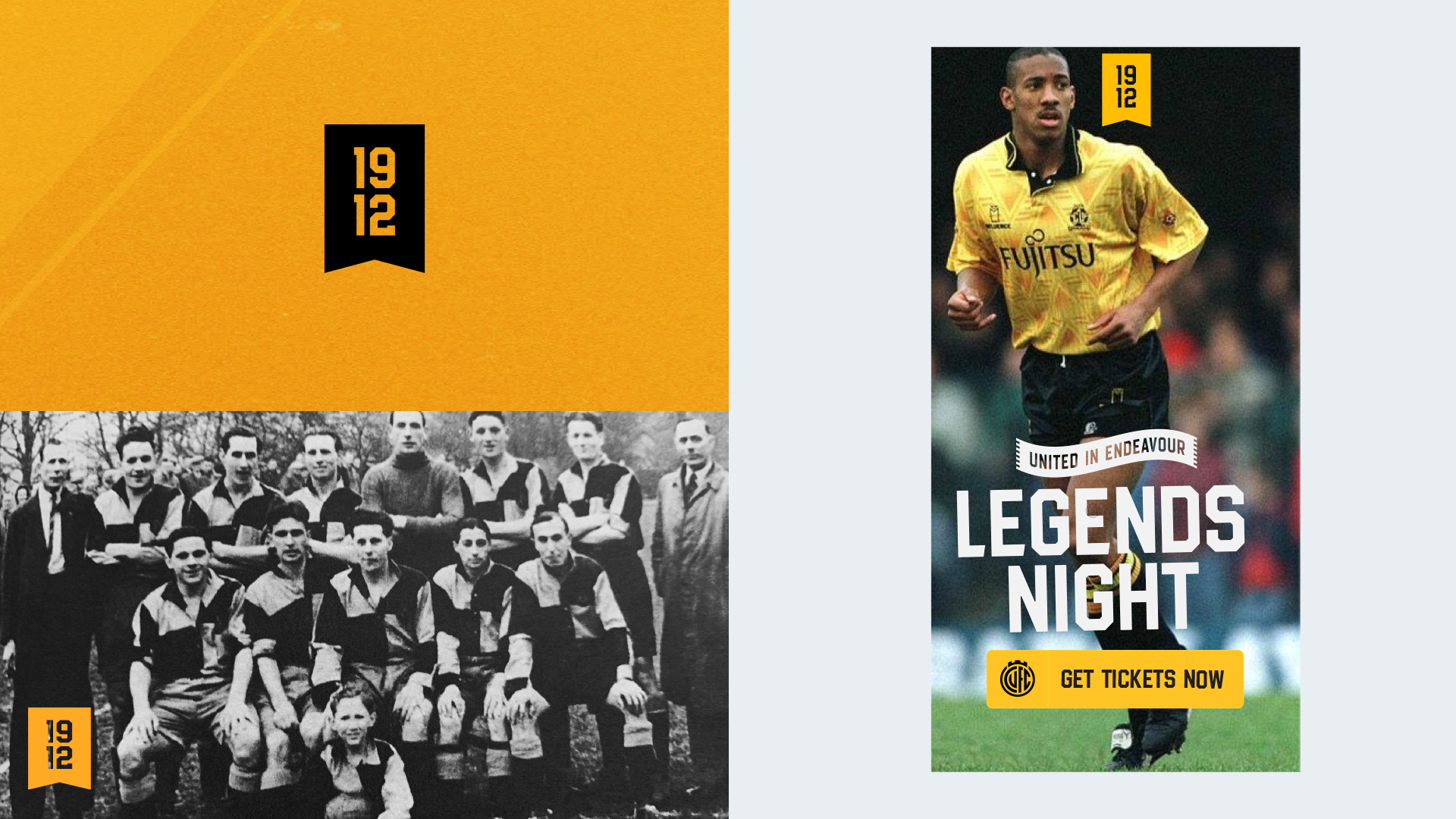
Bookmark – The bookmark represents our educational landscape and will be used to illustrate key dates in our history
CUFC Circle – A simplified version of the new Crest
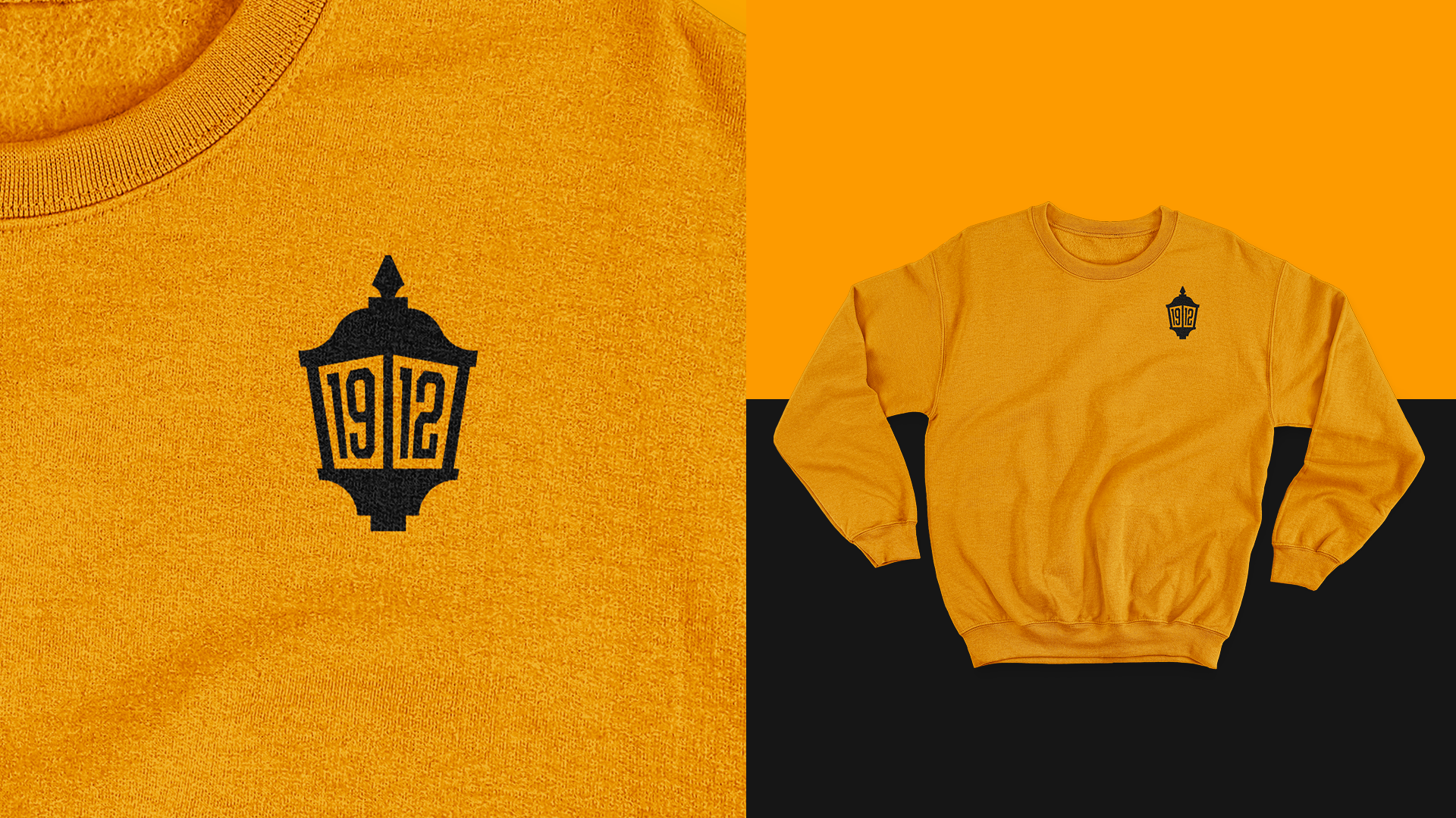
1912 Lamp Post – Represents our city and year of formation
Abbey Stadium – An icon to represent our home and roots of the Club
Book & Ball – This pays homage to our past identity and the rules of the game being established in Cambridge
Marvin the Moose – Our beloved mascot will be used to speak to our younger supporters
Coconuts – Represents our famous Victory Anthem

The new identity will be adopted across the Club from the start of the 2025/26 season in all its forms.
Closing Quotes
Majority Owner Paul Barry said, “I would like to thank everyone who has taken part in this process. There is an unanimous view from Owners, Board and Shadow Board that we have ended in the right place after one of the most comprehensive consultations we have ever held as a football club.
“This new identity is modern and inclusive but, importantly, representative of who we are as a Club and our proud history. It is far from being a redesign for redesigns sake rather we see it as integral to our modernisation programme across the Club and believe it can help us unlock further financial opportunities to the benefit of the playing side of the Club.”
Chair of Cambridge United Shadow Board, Nigel Browne added, “The Shadow Board would like to thank everyone who has taken part in the process and the Club for enabling anyone who wanted to contribute to be given the opportunity.
“The new wider identity allows everyone to be represented and importantly respects our past, whilst allowing us to move forwards.”
Cambridge United give update on ownership structure and plans to redevelop stadium
This is how fans reacted as Cambridge United unveil their brand new club crest with a video featuring Dion Dublin…
@J9R0P: What an excellent video and piece of club communication, a fantastic job all round. The new badge looks great and is an improvement in my opinion (it’s also the one I voted for).
@maxpauley123: Like that
@borismineburg: Best of a bad bunch (of proper coconuts). At least it’s done now and we can all move on. It was always going to divide the fan base but the owners have done more than enough for the club to deserve to change the badge if they want to 💛🖤
@JamesMills1995: What a video and love the transparency of the results! I like the crest, wasn’t my first choice but looks great with Cambridge United underneath Today, tomorrow and forever 🖤🧡
@_Jake_Ellis_: It was always going to change, that was out of the fans control, but on a whole and out of the 3 options, it’s the best one
@vinylperez: It was always going to be controversial, and you can’t please everyone but I think the club have got this decision right overall.
@rybarker16: The decision was never going to please everyone, but you cannot knock the club’s communication throughout situations like these. Top work again 💛🖤
@jackbeeton02: You know what Im happy with this 🙌🏻
@leolewell2: I actually like that i wont lie
@CamUTD_Greatest: The club’s communication and consultation on this process has been excellent throughout. There’s no doubt this has been a considered move to create something that runs deeper than the commercial considerations which prompted the push for change in the first place #CamUTD
@bruinsarchie: Happy with that
@rgn2602: Love the choice and this video is fantastic. Wonderful work from all at the club.
Just be thankful it isn’t this lol pic.twitter.com/11yYaSInLK
— Jason Lee 🇬🇧 (@ForeverOUFC) October 30, 2024


You must be logged in to post a comment Login