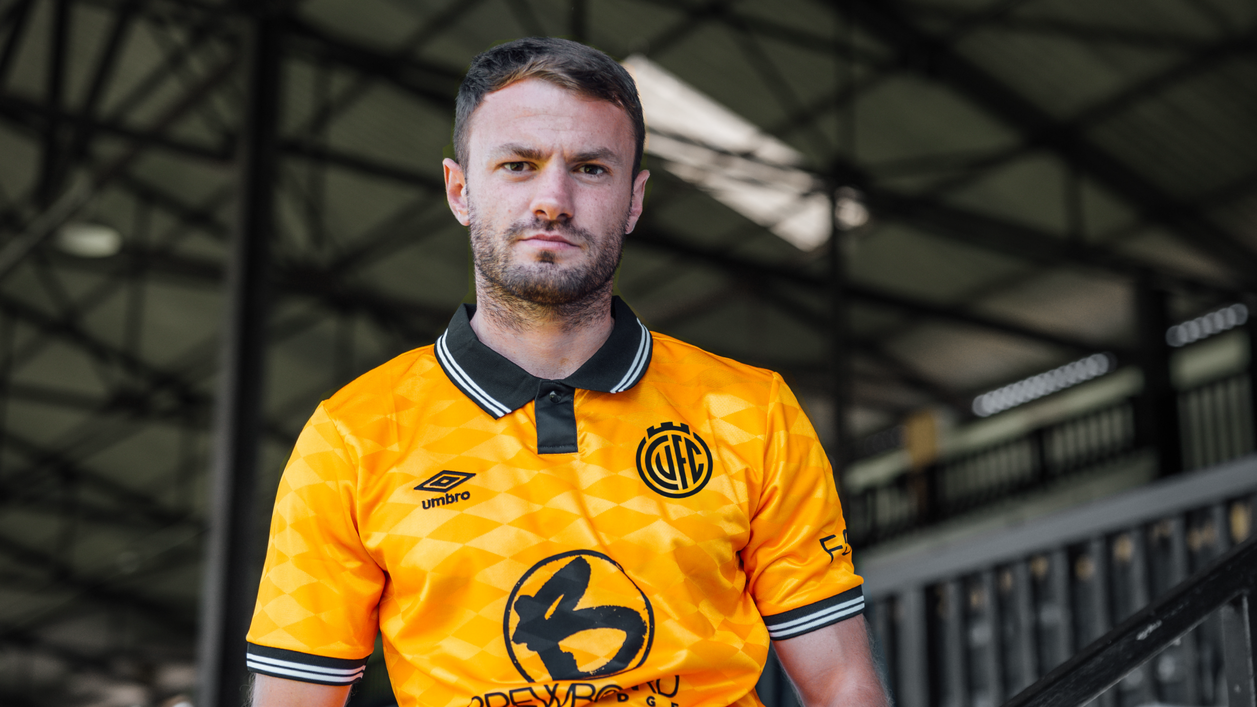
Cambridge United reveal three new proposed crests for fans to vote on, after their last proposed crest design was criticised.
In May 2023, the club started the process of public consultation regarding the possible change or adaption of the club crest, in the form of a supporter survey, only for their initial proposed crest to prove unpopular with fans, so scrapped it.
Then in July 2024, they launched a new set of crests, once again leading to mixed reaction and many calling for them to keep the current crest..
Majority Owner Paul Barry said following conversations between the Board and Shadow Board, the League One club has decided to explore the redesign of the club crest over the course of this summer, mindful of the need for consultation and consent.
Three directions.
Two colours.
One club.United In Endeavour. 💛🖤 pic.twitter.com/HKjkaWYSnT
— Cambridge United FC (@CambridgeUtdFC) July 10, 2024
A month of supporter consultation begins now as we present three new Crest designs for supporters to consider.
— Cambridge United FC (@CambridgeUtdFC) July 10, 2024
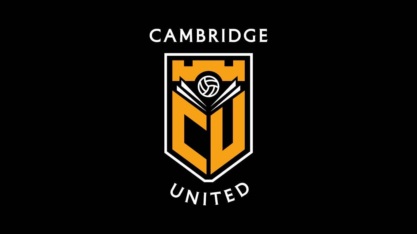
The former proposed crest which proved unpopular with fans
CLUB STATEMENT:
Cambridge United are pleased to reveal three Crest designs for public consultation ahead of a desired change of identity in-time for the 2025/26 season…
The quest for a change in direction with regards to the Club’s crest and identity has been taking place for over a year now, beginning with the initial consultation period last summer.
The Club gauged supporter opinion on the desire for a new Crest, their thoughts on what it should include and represent, before a final survey which gathered feedback on the original proposed design, which was released in September 2023.
After considering the feedback from fans, the Club decided not to pursue the proposed design and has since gone in a new direction, working alongside Football Brand designer, Christopher Payne.
Three different Crest designs have been developed over the course of the calendar year, taking into account supporter feedback from all of last year’s surveys, in-order to give our fans a voice as to which direction the Club should go.
Each Crest offers a distinctly different direction, but we believe that each one is aligned with the Club’s heritage, values and history.Direction One – Evolution
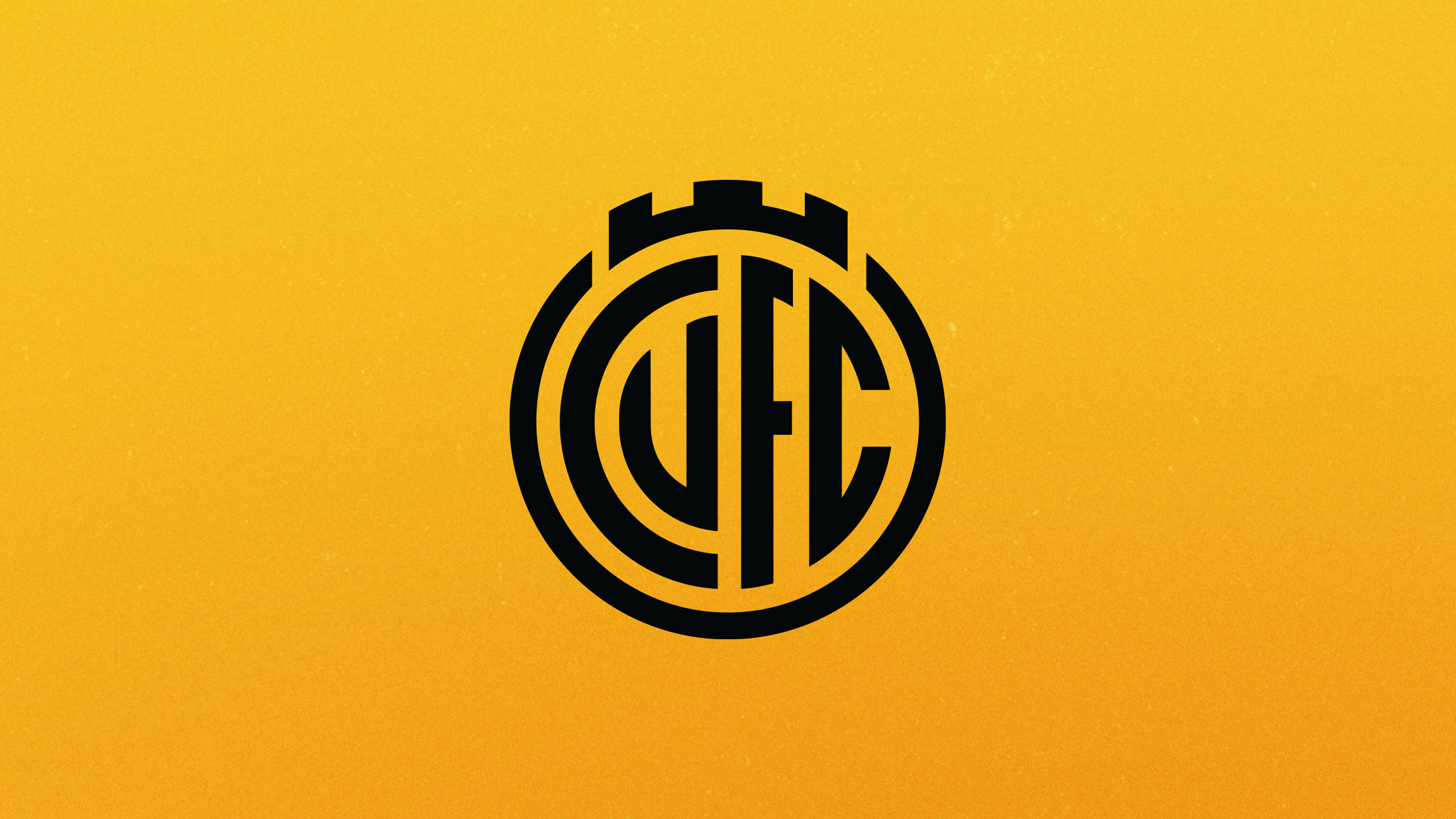
Direction One – Evolution
Direction Two – Abbey Inspired
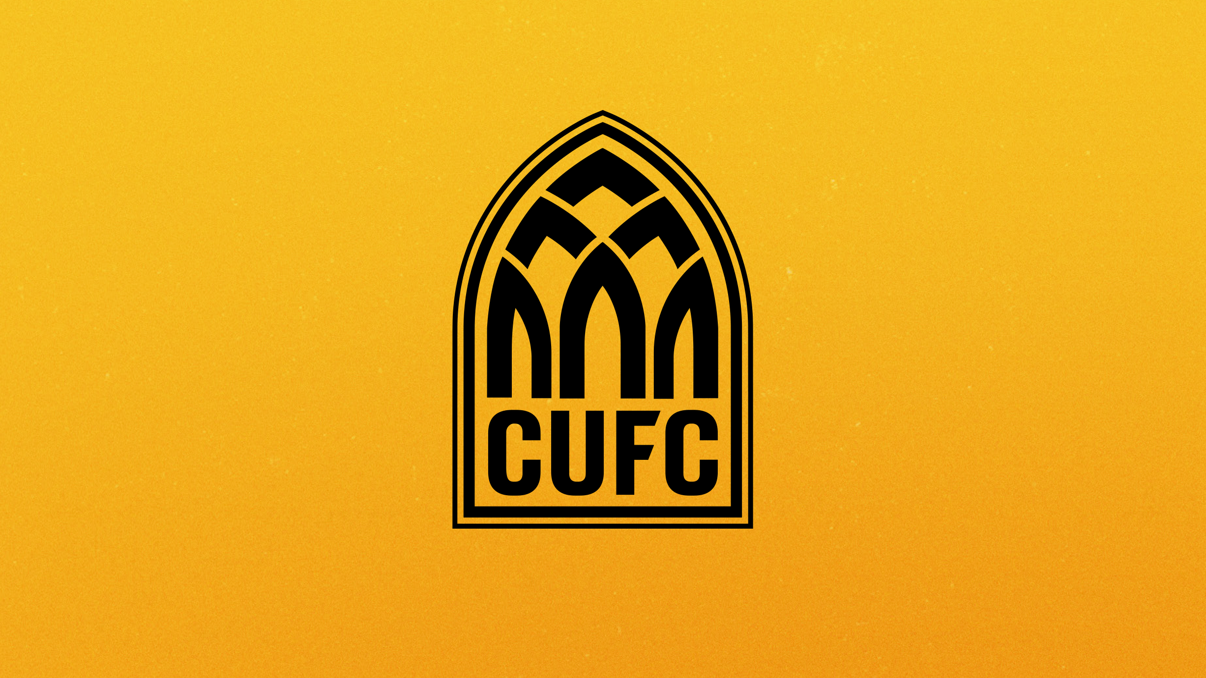
Direction Two – Abbey Inspired
Direction Three – Book and Ball
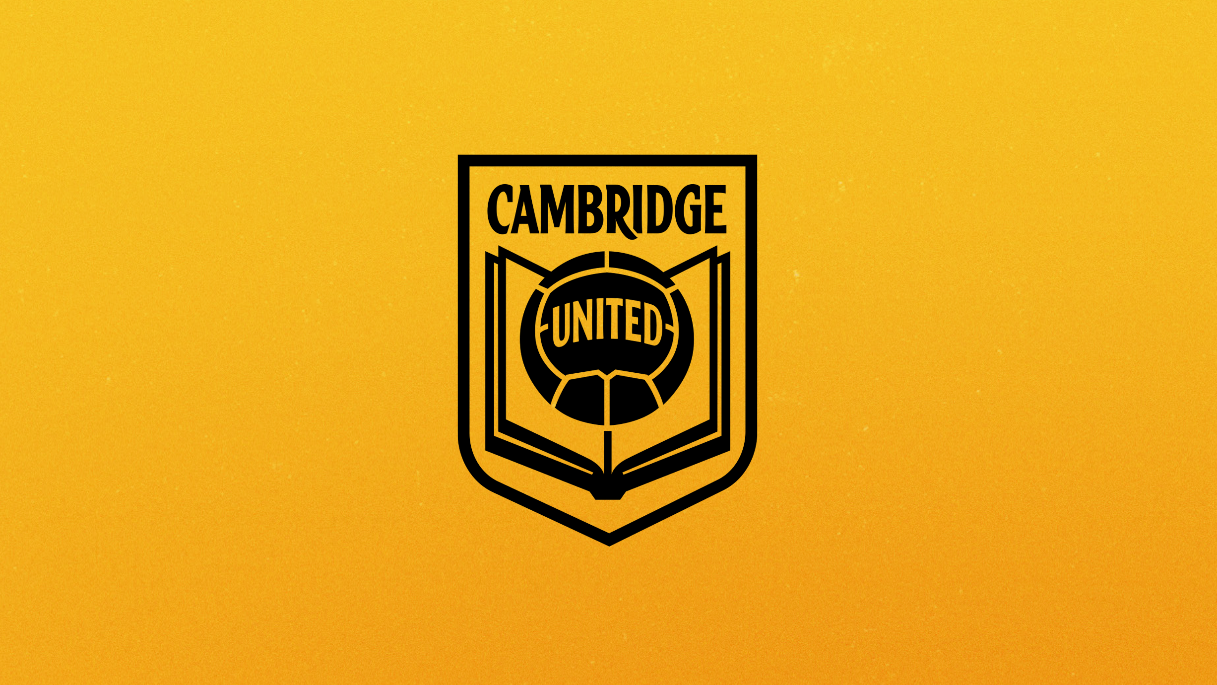
Direction Three – Book and Ball
CEO Alex Tunbridge said, “It has been the Club’s desire, led by our Owners and Board, to explore a new Crest design for some time now, and we are pleased to share these three new designs publicly with our fans. They follow considerable private engagement over recent months with different parts of the Club including the Shadow Board.
“Cambridge United is a football club with a proud history and one which is ambitious for the future. We believe that modernising our crest and identity is important to our growth and development at a time of ever greater sporting and and financial competition.
“We also all recognise that this is a sensitive subject where people understandably have strong views, so our start point has always been to do this in full collaboration with the fans. It is why we didn’t push through the proposed new design this time last year.
“During that process we gathered a huge amount of feedback from supporters and we listened and learned a lot. This is reflected in how we are approaching this next stage.
“There are three proposed designs that are all different, but all representing the Club and our city past and present in unique ways. We want to provide fans with the opportunity not only to see these crests and let us know what they think, but to also allow them to engage with us face-to-face via public events throughout the upcoming month.
“We hope fans from every part of the fanbase – young and old – will take the time to look at all the materials and give us their considered feedback on the three directions over the coming weeks.”
Designer Chris Payne added, “An important part of this process has been to listen to all fan feedback leading up to and following the previous design, to better understand what the fans want in the Club’s Crest.
“It was a fascinating process, with many suggestions and differing viewpoints. Some fans called for us to modernise the current identity. In contrast, others wanted a more traditional design, some wanted to see the book and ball reintroduced, and other sections of the fans called for us to be bold and innovative and create something unique.
“It’s hard to please everybody, but by being transparent and offering three different designs that all offer something different, we can get an idea of which direction the majority of the fans prefer.”
Supporters and members of the community have the opportunity to provide feedback on the designs and register their preference, in the form of a number of consultation events over the course of the next month.
An online survey will then be issued w/c Monday 5 August for fans to officially state their views.
- 10 July – Foundation Kicks Sessions
- 12 July – Club Board Meeting
- 17 July – Business Club Event
- 18 July – First Team Consultation Session
- 18 July – Volunteers Training Evening
- 24 July – Soccer Camps Session
- 23 July – Shadow Board Meeting
- 25 July – Fan Consultation Event
- 25 July – Staff Consultation Event
- 25 July – Academy Consultation Event
- 30 July – Fans Open Day
- 1 August – Foundation Seniors Lunch
- 2 August – Pre-Season Home Game vs West Brom
- W/C 5 August – Online Survey
Upon conclusion of the events the feedback will be analysed, any appropriate refinements made, and a final design will be selected by the Owners, Board of Directors and Shadow Board, which will be used from the 2025/26 season.
Please take your time to digest the videos, information and images about each Crest. This is an exciting opportunity to help shape the future of our Club and we are delighted that our fans will be a big part of the process.
Cambridge United reveal three new proposed crests for fans to vote on, this is what they’re saying on Twitter…
@maxrushden: 1 or 3 for me Clive x
@derbynutter: What isn’t broke doesn’t need fixing keep the current badge @CambridgeUtdFC
@fusionjosh_: This video is incredible 👏🏻 If I had to pick. Badge 3
@jord96cufc: I really don’t like any of these, none of them close to being better than our current badge.
@ColinPep1: If this is what they come up with, just leave the current one alone. Change for the sake of change is not necessarily an improvement.
@CretanSun8: On first two designs I’d ask for my money back spent on those developers, horrendous! Third option with the book still less appealing than current one. Leave the badge alone, not all change is good change.
@MrLiamArnold: 1 is decent 2 feels upside down 3 is okay. Current badge is as good as 1 though.
@themeatbeast: They are all Awful! Get kids to design it it will be better than these options.
@Angel_In_Amber: None are better than the current one. Why did a ‘designer ‘ take a year to come up with what a year 5 class could do in an hour. Still looking for a Lily on the Cam.
@ColinPep1: Three horrendous efforts. But if you had to choose one I guess it’s the second one. But it’s like choosing who your favourite serial killer is.
@GaryStroudCUFC: 3 for me at a push 1 but definitely not 2
@MGCUFC: Where is the reference to Cambridge in the first two beyond CUFC which could be any club as in Colchester or Carlisle. If you want to identify with a city, surely you have to name that city in the badge (as the current one does by the way)
@Oli_380: Tbh they all look like Football Manager style present designs, I’d stick with the one we have right now over these 3
@JimHeslop2: Definitely the first one. Retaining the circular shape is a must for me. Dan
@Avesycufc: the first badge is basically inter milan so we should go with that one
@lambymx69: Nothing wrong with what you have keep the current and don’t put any more money and time this project
@Jake040122: Are you actively proposing terrible badges
@_fred_norman: Current badge.
@onlyuseto: Three a solid yes, two is meh, one defiant NO! 💛🖤
@palmerstonblues: If it’s down to one from these three, then for goodness sake, just stick with the current one 🧐
@Grafterson: Refinement culture. Too abstract. Garbage. I like the current badge. It’s brilliantly shit. It’s basically a bit “FUCK YOU” To everyone who looks at it, which is just how a football badge should be. Perfect.
@DaveStacey47344: I hope you haven’t paid people to work on this?
@Goooolazzo: 1 would get my vote out of the 3. 3 would be my next choice but just feels a little forced to me tying to get relatable things into the crest, where with 1 they are subtly there. 2 is a no from me #1Direction
@DanJordan90: 1. Inter Milan 2. Pineapple 3. Meh. Maybe an unpopular opinion but I’d rather stick to our current badge, than use these . If pushed I would say 3.
@SamGFC_: Why do clubs insist on change historical badges to something so generic and meaningless? These are bloody awful lads
@SwindlehurstJ: The problem with opening this up to fans is everyone suddenly becomes a graphic designer and needlessly scathing of the designs. I think it’s a good thing, especially as our current badge is dog – I like number 3.
@J9R0P: Badge one with heritage branding of badge two would get my vote.
@TO_echte_liebe: 1 is sensational. Love it. All way better than last time. The future is bright
@laura_denton22: Again, brilliant video but I hate them all 😫
@howardscott_: They’re all shit
@not_pota: If we were forced to change badges right now, I’d take the first one, I feel it wouldn’t take much to change the second one to make it look decent, third one is shit
@Avesycufc: surely the first one is the only right call?
— George Rawlings (@GeorgeRawlings4) July 10, 2024
Current badge all the way! Doesn’t need changing! pic.twitter.com/MpwrWnMHkz
— Lauren Lock (@LaurenL01099761) July 10, 2024
Desperately trying to follow posh 🤣 pic.twitter.com/9k3M6odVuP
— Luke Pywell (@lukejuanpywell) July 10, 2024
— Seth Hemingway (@HemingwaySeth) July 10, 2024


You must be logged in to post a comment Login