Peterborough United unveil their new home kit for the 2026/27 season after facing backlash from fans over their new crest.
10 months ago, the Posh unveiled their new badge, to be used from June 2026, with Darragh MacAnthony explaining the reason behind the change.
In January, the plans didn’t go down well with fans, with many saying to the club ‘if it ain’t broke then don’t fix it’, and to instead use the money on ‘sorting the team out’.
Peteborough said at the time that they have made the decision to undergo a brand evolution, starting with a supporter survey to gather fan input, which is a common practice for clubs looking to modernise or rebrand their image.
Monday. 10am.
Our new identity goes live across every social and digital channel.
Shaped by thousands of supporter voices. Now it’s yours for good.
Full story 👉 https://t.co/NzHWKAsitx#pufc pic.twitter.com/Yjrc8zDYP1
— Peterborough United (@theposh) May 30, 2026
View this post on Instagram
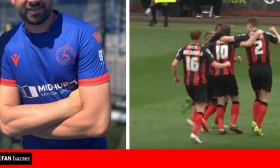
The club said in a statement: “We are proud to unveil our new 2026/27 Home Kit, the first to feature our new identity.
“As we move forward, we wanted a Home Shirt that places full focus on our new crest, marking the beginning of a new era. The campaign showcases this new chapter from a range of perspectives, featuring Posh supporters, club staff and Director of Football, Barry Fry, as the voiceover.
“Our new PUMA Home Kit for the 2026/27 season is now available online via the Posh Online Store.
“The shirt is presented in our traditional Posh blue, featuring a standout crossover ribbed crew neck collar alongside official team branding and sponsorship.
“A special thank you to Mick George, Princebuild, Next Level Fibre Optics and Kings Power Solutions for their continued support.
“As part of PUMA’s RE:FIBRE programme, the shirt is made from at least 95% recycled textile waste and other used materials.
“The 2026/27 Home Kit campaign tells a story of new eras, new beginnings and new seasons as we enter the next chapter in the club’s history. Centred around the launch of our new crest and identity, the campaign reflects the connection between our proud heritage and the future we continue to build together.”
Peterborough unveil new club crest with Darragh MacAnthony explaining reason behind change
“Narrated by Barry Fry, the film captures the spirit of the club through the people, moments and memories that have shaped the Posh across generations.
“This is a story about letting history inspire our future, about moving forward but never forgetting our past.
“From club legends to the next generation of supporters, the campaign celebrates everyone who has proudly worn blue and white.
“Referencing iconic names from across the club’s history alongside current supporters and young fans, the campaign reinforces the idea that every generation has a role in shaping what comes next.
“The new Home Kit and crest represent more than a new look for the 2026/27 season. They symbolise progress, ambition and identity while staying true to the traditions and values that define Peterborough United.
“The campaign tagline, ‘The New Era’, is an invitation for the next generation of players, supporters and staff to make their mark and continue building the club’s legacy.”
View this post on Instagram
View this post on Instagram
View this post on Instagram
Here’s the social media reaction as Peterborough United unveil their new home kit after backlash from fans over their new crest…
@saunds98: As bad as the new crest is, doesn’t look too bad tbh #pufc
@DylanPUFC: Negatives, shirt is easily a 4-5/10. Positives, release at 19:34 (nice touch) and the video is absolutely class. #pufc
@theposhfan: Video is great, so kudos to whoever made that. I won’t carry on banging on about the badge. Shirt is ok, not wow, not horrific. What a shock to see Del in the limelight!
@connortlv: This whole thing is a prank right? The shit badge, the shit kit, the awful comms. It’s all just a funny joke. Right? … right?? #pufc
@ShiellB1: Looks good to me. A nice, simple design without trying to do too much. Looks clean and neat, I think. Obviously people will say they despise it because they want to be angry at everything the club does at the minute, but it’s better than last season’s, imo. #pufc
@nathan_young92: I actually don’t hate the kit? Not sure if I’d pick it up but it’s alright as a home kit goes 🤷🏻♂️ #pufc
@clarkbatfan: I thought the badge was gonna be the worst bit of this season but congratulations on making the kit even worse 🤣🤣
@TommyJRoberts: Video great, like it being released at 19:34 it’s like someone actually thought about it 👏🏼 but the shirt is a missed opportunity imo.
@PaulDay1552789: Oh… it’s hideous #pufc
@gempufc: Less said about the new badge the better, also I swear the sponsor gets bigger every season 😂 #pufc
@RRMorleyy: It’s just so fucking shit isn’t it… like I’m not being funny it doesn’t look good in the slightest. It’s a fucking logo not a badge… and the kit looks like a template you get on some shitty soccer game from 2008. #pufc
@Gameday523: Well at least the launch video is good. Kit very meh. It is growing on me a little bit. That badge definitely ruins it though.
@Riggers_80: Why would you have the word posh on all your branding, but not on the kit
Am I mad for saying our home kit looks better than there’s 😅 #pufc https://t.co/acMlhkDAqR
— UnpopularPosh (@UnpopularPosh) June 2, 2026
Oicial Club Statement:
We are ucking idiots who cannot perorm a straightorward task#pufc pic.twitter.com/8svwHBatqA
— James (@jmsb1997) June 1, 2026


You must be logged in to post a comment Login