Middlesbrough unveil a permanent new crest to be used from the 2026/27 season, tying in with the club’s 150th anniversary celebrations.
Two years ago, Boro fans put forward their crest design ideas as the club announce a plan to change it, with the Championship outfit announcing part of the preparations for this significant milestone, the club will be unveiling a new club crest to replace the current emblem that has been in use since 2007.
The decision to introduce a fresh badge is a key element of the club’s strategy to honour its illustrious past and connect with its dedicated fan base.
We’re delighted to introduce Boro’s new crest 🔴⚪️
A celebration of our 150-year history, the crest will be implemented permanently from the 2026/27 season onwards. pic.twitter.com/t9WHukVSGN
— Middlesbrough FC (@Boro) October 16, 2025
A journey of 18 months, as we prepare to celebrate 150 years ✏️🎨
Here’s a look at the process which brought our new crest to life. pic.twitter.com/BH3L8bvMYR
— Middlesbrough FC (@Boro) October 16, 2025
CLUB STATEMENT:
We’re delighted to introduce Boro’s new crest.
The result of an extensive process with Boro supporters at its heart, the new crest will be introduced permanently from the start of the 2026/27 season, tying in with the club’s 150th anniversary celebrations.
As well as the new, main crest, a special anniversary version – with an additional 150-year signifier inspired by the Ayresome Park gates – will be used during the 2026/27 season only, including on Boro’s kits.
The Crest
A return to the roundel shape overwhelmingly preferred by fans and made famous by the crest used by the rejuvenated club that roared back from the brink of extinction in 1986.
The club’s founding year of 1876, split across a white band that has been synonymous with Boro since being introduced by Jack Charlton in the 1970s.
Middlesbrough Football Club’s name proudly in full, in a slab-serif font further denoting the region’s industrial roots.
The lion rampant, a historic Middlesbrough symbol going back to the town’s origins with the De Brus family.
Incorporated within the developed lion shape, two Teesside landmarks; the shape of the River Tees as it meets the Riverside Stadium, in the lion’s tongue, and the outline of Roseberry Topping within the lion’s mane.
View this post on Instagram
The Process
From our initial announcement 18 months ago, to our launch today, the project to introduce a new crest has involved our fans every step of the way.
Our initial engagement with supporters delivered a mandate to explore the change, while further consultation helped drive the brief and hone the finer details during the design process.
The Next Steps
The crest will be officially implemented from June 2026, as we prepare to mark the club’s milestone 150th anniversary, with the centrepiece of the celebrations taking place that October.
More information on these celebrations will follow soon.
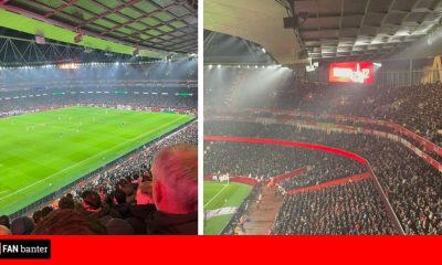
This is how fans reacted as Middlesbrough unveil permanent a new crest to be used from the 2026/27 season…
@Paddy_Baller: 👏🏼 Not every one will be happy. But from being involved in the workshops. I think the majority of feedback has been included and this video highlights those features of Roseberry Topping, The River, Steel, White band, rampant lion and circle design. Smashed it 👏🏼
@JamieL_UTB: Quite happy we’ve gone back to the old style badge. UTB
@boro_alex2: This video genuinely makes me want to run through a brick wall for the club, fucking love these lot
@_TY_97: Round badge we have never been more back, give me that in the centre of the home shirt next season and I will blow all my money on it
@oli_tatty: Big fan of this. Has everything it needed, but remained simple yet effective. Defo gonna miss the current one tho, all I’ve ever known as a boro fan.
@Joseph_Devlin1: Spot on this 👏 people will always find something to complain about but its simple, clean, and works
@Smithy_MFC84: Yesssssssss!!!!! A lovely piece of promo to go with it, the subtle nods add real meaning too. It’s a bloody lovely, and rightful return to a circular design that didn’t need meddling with in the first place. Well played #Boro #UTB
@MackemSlayer69: Shit bring back the old one me and the lads kicking off with it
@ElliotUTB: its alright but I do think it’s a bit of a downgrade to the current one
@JacobHorsfall_: First badge to go from non-circle to circle and it look significantly better? Fair play, Middlesbrough.
@justcalledtosay: I think it could’ve been so much better.
@ShrimpsKits: Yes it’s another roundel. But Middlesbrough did traditionally have a circle badge, similar to Man City. Really good effort here.
@rossutb88: Why is everyone moaning. Everyone wanted it to look like the old badge, we release something similar, everyone says it shite 🤣 Our fans are the gift that keep on giving 🤣
@Loulameg: An absolute thing of beauty 😍😍😍 & everything that it should be, it misses nothing out at all & encapsulates everything!!! it’s fantastic to see the club listened to the fans. Well done @Boro you did so so good ❤️ 👏👏👏👏👏👏👏👏👏👏👏👏👏👏
It’s fine. It was always going to be a simplistic design (that’s just the way things are going).
I think it would’ve looked better without the lines either side of 1876, but I suspect that was an attempt to distinguish it from the 1986 badge.
Clean and simple🛡️ https://t.co/Z6WkCQzTBA pic.twitter.com/2igEd2ruzh
— Chris (@Chris_BoroUTB) October 16, 2025
The original circle one is so much better pic.twitter.com/d9oZTw8gpe
— Gazboro (@GaryCla27663307) October 16, 2025
Nailed it. Perfect time to get this retro badge on the away kit next season pic.twitter.com/HasoM7NDps
— Harro (@TheEightball80) October 16, 2025


You must be logged in to post a comment Login