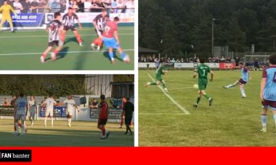
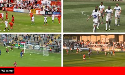
FC Isle of Man unveil their new club crest this week as they prepare for entering the English football league system next season.
In December, that their application to join Step 6 was to be taken to the Football Association by the North West Counties Football League. The NWCFL stated that they will recommend that the club are accepted, providing the appropriate criteria is met by the 31st of March 2020.

www.fanbanter.co.uk – Fan reaction to the latest football news, gossip & funnies
Last week, they named Chris Bass as the club’s first manager, having managed St Georges FC for over 30 years, and in that time become the most successful club manager in Manx football history.
The club said: “In line with the philosophy of our parent company Sporting Club Isle of Man, the crest has been carefully crafted to not only reflect the essence of our Island’s history, colours and community but also, importantly, to represent our confident sporting approach.
“The full brand story will be released soon, but here are some of the key design elements:
– The Black Raven is one of the national birds of the Isle of Man and is synonymous to Celts and Vikings with battle, intelligence and problem solving – and is depicted ready to attack
– The red and white colours represent our stunning sunsets and infamous Manannan’s Cloak
– The four water lines represent the North, South, East and West of the Island, symbolising unity and community
– The words “Bee ny Share” is Manx Gaelic for “Be Better”
FC Isle of Man Sporting Director Paul Jones stated: ” We are delighted to unveil our new Club Crest, which mirrors the philosophies of Sporting Club Isle of Man.
“The design values within the crest are set to inspire our home and away kits, which we’ll be providing more details in the coming weeks.”

www.fanbanter.co.uk – Fan reaction to the latest football news, gossip & funnies
Fans reacted as FC Isle of Man unveil their new club crest…
Love the badge good luck with the venture⚽️⚽️⚽️?
— jim (@jim_jim57) February 28, 2020
Really like that club crest, and the nod to the Viking and Celtic past with the raven ??
— The 94th Minute ??????? (@The94thMin) February 27, 2020
Think it’s great! I actually like that it doesn’t have the three legs! It’s different, like FC IOM, so why should it be the same as everything else!! Looking forward to the first game!
— Ruairi (@RuairiPoole) February 27, 2020
Either that or a big nod to the IoM Albanian community.
— Triggs (@triggs14) February 27, 2020
Looks awesome, guys. Great work.
— Chris Brannigan (@IomRdo) February 27, 2020
Nice work! It's great that it doesn't include the entirely predictable 3 legs of Man!
— Alan (@AlanOfMann) February 27, 2020
It was in one of the earlier designs but we felt the 3-legs should be for National teams as it’s sooo associated with the IOM. We also wanted to do things differently and reflect other parts of our heritage – to challenge the norm.
— MovetoPerform (@PJones78) February 28, 2020


You must be logged in to post a comment Login