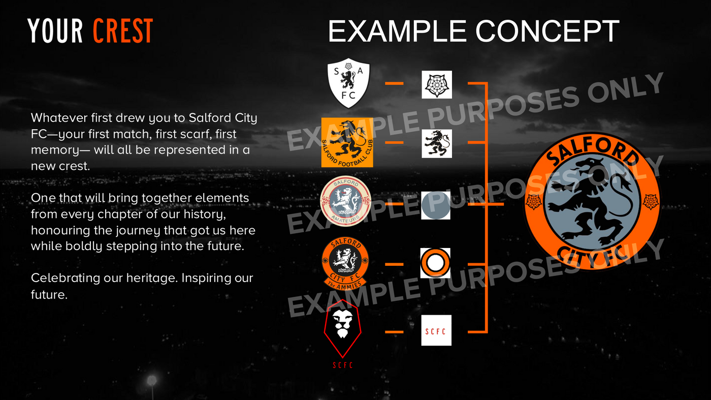
Fans are to vote on a newly proposed crest for Salford City ahead of plans to revert club colour from red to orange.
A new circular crest, designed by New York-based global agency MILK, brings back “Salford City FC” text, something has has gone absent since the red rebrand in 2014, with the font inspired by iconic artists and musicians.
It features a forward-facing lion, symbolising future ambition, and brings back the rose, with co-owners Gary Neville and David Beckham strongly supporting the change.

Photo Credit – nigel.wass74
CLUB STATEMENT:
Salford City is excited to present a new Club crest option to supporters, ahead of a vote on whether to change in December.
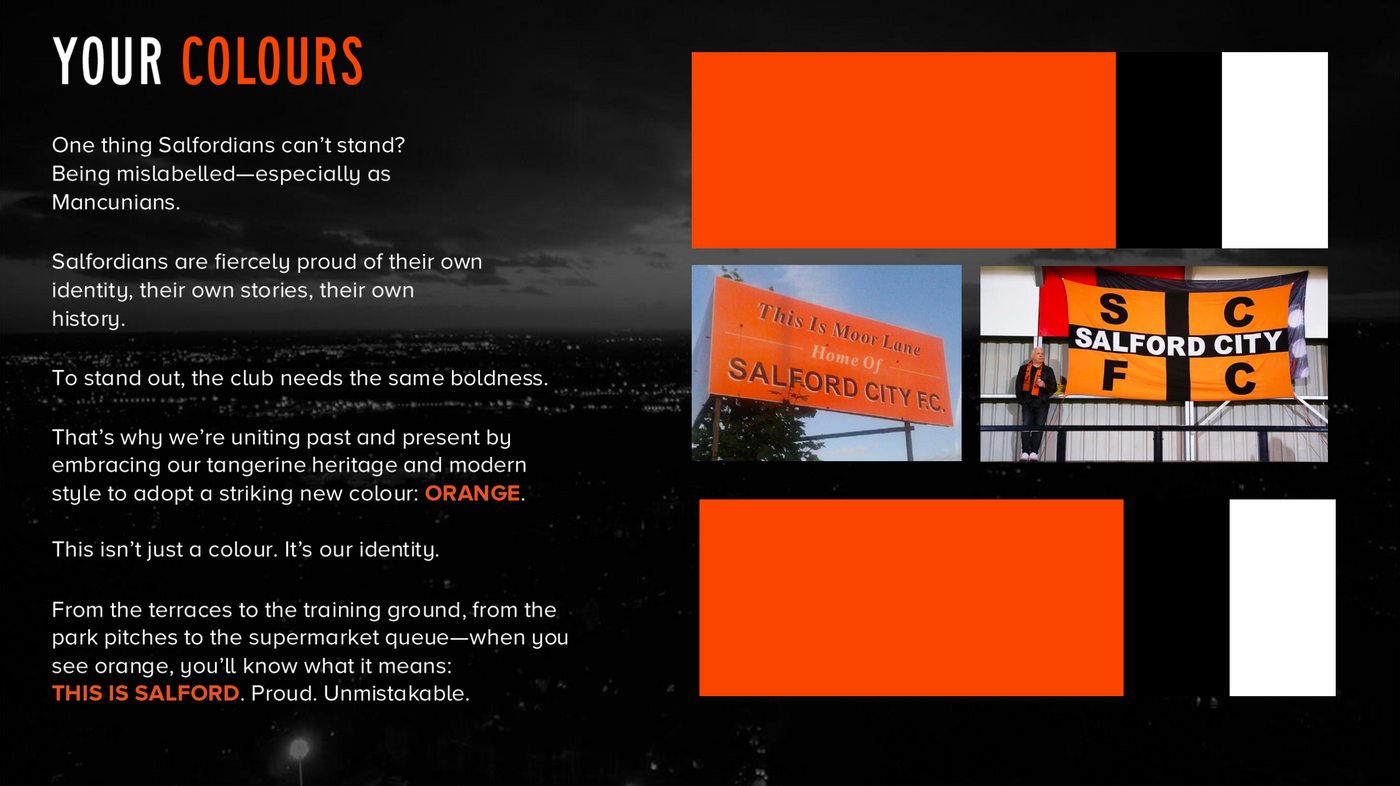
The proposed crest change is the second part of a heritage consultation, which has already seen fans vote to revert the Club’s primary home shirt colour back to orange.
Working with leading global design agency, MILK, this option has been created using iconic Salford elements to give Salford City FC a striking new identity that reflects the Club’s values and aligns with our global ambitions.
This design was presented to season ticket holders by Head of Creative, Andrew Gordon and co-owner Gary Neville who, alongside Sir David Beckham, are supportive of the change. The presentation also included a video from David explaining the rationale for the proposed change, the parallels between this process and the one that he went through with Inter Miami, and his excitement to help bring Salford City to a global fan base.
Of the approximately 100 in attendance, despite some initial scepticism, a hands-up poll indicated that 95% of the room would be in favour of voting for the change having listened to the way that the crest has been crafted and the reasons for proposing the change.

Fans are to vote on a newly proposed crest for Salford City ahead of plans to revert club colour, here’s the social media reaction…
@yellows4life: rather like the new crest, also rather like the current one. can see what they’re trying to do. i’d place a small rose head either side of text at the bottom, but also looks a bit strange that it’s ‘CITY FC’, maybe make it so SALFORD CITY / SALFORD CITY FC fits at the top, and THE AMMIES at the bottom
jdminuzzi: Both are good shields. But the current one is so famous and recognizable… they could just change it to orange.
lorenzo_bordignonbc: Much better! 👏👏
mat_messi4s: I prefer the current one.
blimeyoriley: not sure about the way the rose looks, bit strange on the side there
rodrimarques97: Much closer to the original, before the acquisition of the “Class of ’92”. For me, it turned out excellent.
jcffreitas: The current shield is more iconic; they could just change the red line to orange.
artdiguetto: The current one is much more interesting. The new proposal is more generic.


You must be logged in to post a comment Login