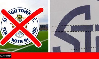
Solihull Moors unveil a dramatic new crest and rebrand but fans aren’t happy with what they they are seeing on social media.
Just weeks on from losing in the National League playoff final to Grimsby Town, the club have undergone a big change.
However the new look hasn’t gone down well, proving unpopular with many and yet again another circular crest is used.
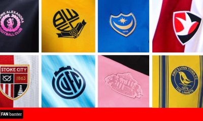
Club logos in the shape of a circle have always been around, however it became more common ever since Manchester City changed theirs, and now we’re seeing more and more sides axe the traditional unique badge for one that suits social media it seems… and quite frankly it’s getting boring now and before we know it we won’t know who is who with everyone having the same template.
CLUB STATEMENT:
Solihull Moors Football Club is excited to reveal its new crest which will be used across all club branding with immediate effect.
Working alongside Solihull-based company CM Brand, the process of developing the crest started with the aim of achieving a clean and modern crest that is instantly recognisable and practical to use.
As the club continues to deliver both on and off the pitch, we believe now is the time to evolve and transition into a new era for the club.
In recent years, the club has developed a ‘brand style’ that is now visible and recognisable across all its channels, and the new, contemporary design reflects the progressive approach being taken across the entire club.
15 years have passed since Solihull Borough and Moor Green merged to form Solihull Moors in 2007 and we still pay homage to both clubs to this day.
The club is extremely proud of its history, dating all the way back to 1901 following the formation of Moor Green.
And that’s why, each season, the away kit colour is a nod to our roots – alternating between the red and white of Solihull Borough and the light blue and dark blue of Moor Green.
The change will see the Griffin become front and centre of the crest, which will appear on the home and away kits of Moors, as well as training and leisurewear and merchandise.
The new crest will become more prominent around the ARMCO Arena over the coming months as we begin the changeover process.
Brand Refresh
Background:
- Solihull Moors FC was founded in 2007, by the merger of Solihull Borough and Moor Green. Located in the heart of the West Midlands, our historic community focussed club continues to deliver both on and off the pitch.
- The existing crest came about as an amalgamation of various elements from both clubs and the wider Solihull area.
- After developing a modern brand style that is now visible across all channels, a review of the club crest was also undertaken with the aim of modernising it and creating more of a contemporary design.
- The new crest will work across all channels and become instantly recognisable – something that the current mark struggles to achieve at smaller sizes.
The Requirement | New SMFC Crest:
- A clean, contemporary, and modern design which will help to grow the club’s profile in an ever-evolving digital and social media landscape.
- To ensure the crest demonstrates a strong and proud link with the Borough and is clearly discernible with Solihull – lift the Griffin’s head from the Solihull Coat of Arms to form the new crest.
Why the Griffin?
- The Griffin is taken directly from Solihull’s Coat of Arms. The Solihull Coat of Arms represents various coats of arms from the Solihull area.
- The Griffin is taken from the arms of the Finch family, Earls of Aylesford, who have held the lordships of the manors of Bickenhill and Meriden.
- In heraldry, the Griffin’s amalgamation of lion and eagle gains in courage and boldness.
- The Griffin is used to denote strength, military, courage, and leadership.
- #StrengthCourageLeadership will represent the core values of Solihull Moors.
- The image of the Griffin design can be equally as strong when taken out of the new crest, acting as a brand and image in its own right.
As mentioned, Solihull Moors unveil a dramatic new crest and rebrand but fans aren’t happy…
@jordmarley: Another club ruining a perfectly fine badge with that awful “circle” template, looks terrible
@G_D2S: What is that 🤔😂
@SkyBlueSam87: Sorry prefer the old one 💯🙈
@NebUtd18: That’s bloody awful
@tjd01_: That’s vile 🤣
@festa34: that’s like youth football badge . @SolihullMoors you need to have a rethink
Solihull Moors have revealed their new badge (right) ahead of the 22/23 season.
Not entirely convinced it’s an upgrade on the old crest (left). Pretty characterless. pic.twitter.com/uxcrf4SaTN
— Amos Murphy (@AmosMurphy_) June 29, 2022
@72jamesk: That’s awful why didn’t you design several badges & let the fans decide..?
@mattjonesminty: Horrific lads. Bit late for april fools this..
@miyasprivate: 😬 the badge…
@im_greenwood: Announce big signing to mask this catastrophe
@domphillips02: Oh dear. This hasn’t gone down well
@BluSabre: That’s terrible 😂
@danbirtless: wtf is this
@pete_s_clark: Dreadful
@RRWB_: Gone from a unique crest to a generic thing that every club seems to be doing. Poor.
@eez_eh_peez_eh: That’s absolutely awful, go back to the old badge or at least give us options better than a child’s crayon sketch
@slowlybutsurel9: laughable
@_K_R_O__: Awful. Had a great proper football club badge and this has been decimated with an awful cheap marketing geeks dream. Awful
@DanKellettPNE: Circle badges are killing the beautiful game
@DanGray94: The only thing I like about this video is that I’m in it… not a fan of the new crest at all 😔
@ExpatEgg; This is shocking.
@AEJ03_: what in the name is this 🤣🤣🤣
@wwfcscott: That is … erm… awful.
@Mathew_scfc: Wtaf is that
@jaw1992_: What in the PES2009 is this?
@gtfcdan147: That’s bloody dreadful 🙈
@Brxndinho10: Ripped the soul right out of the club right there. Awful
@thfcollie03: Unreveal it
@DaveHarris_44: This is absolutely terrible, who was consulted for this? Surely none of the fans 😂
This means the mascot’s probs gonna change too, Never forgotten son #nationalleague #youmoors pic.twitter.com/AkoLuHxjUA
— Harry Dishington (@HarryDish7212) June 29, 2022
Almost as bad as this monstrosity pic.twitter.com/sKKtkIza0x
— Paul (@PaulllllLarter) June 29, 2022


You must be logged in to post a comment Login