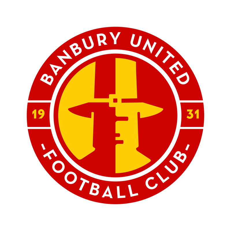
Banbury United unveil their new club crest after a fan consultation process was held to get an idea of how it should look.
Fans put forward a clear preferred logo choice in a recent consultation survey on the new logo direction, and on some other key club experiences having had the current Puritans man design for approximately 34 years.
This helped the Board and the design team with a clear majority of those who responded to it, 68%, being in favour of a change to the club logo. Sixty per cent supported the creative direction presented.
New Club crest is revealed 🔴🟡
Banbury United has a fresh look for a fresh start
We are pleased to reveal our new logo today as the Club embarks on a concerted comeback with the most energetic vision for our future.
Thank you to everyone who participated in our fan… pic.twitter.com/2QSpobgnas
— Banbury United FC (@BanburyUnitedFC) April 23, 2024
CLUB STATEMENT:
Banbury United has a fresh look for a fresh start
We are pleased to reveal our new logo today as the Club embarks on a concerted comeback with the most energetic vision for our future.
Thank you to everyone who participated in our fan consultation, which has helped us get to this point of being able to proudly present ourselves with a modern look worthy of a relevant, bright and confident football club, in 2024 and beyond. We present a contemporary badge that will look much more professional, particularly on clothing, merchandise and other branded items that go towards increasing the brand value of Banbury United.
Based on your feedback in our consultation, the logo features the following enhancements:
Developed roundel and type, to simplify it, make it less ‘American’ and use a typeface that felt more contemporary.
Thickened white border so it sits better on a red shirt.
Added simple facial features to make the Puritan more recognisable.
Reduced the colours to just one red, gold and white to be closer to the Club’s identity.
Softened some of the Puritan’s features, to make it look less like a bottle-stop!
Not everyone will like this logo straight away of course. That’s the nature of design projects, regardless of the entity involved.
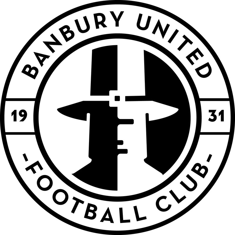
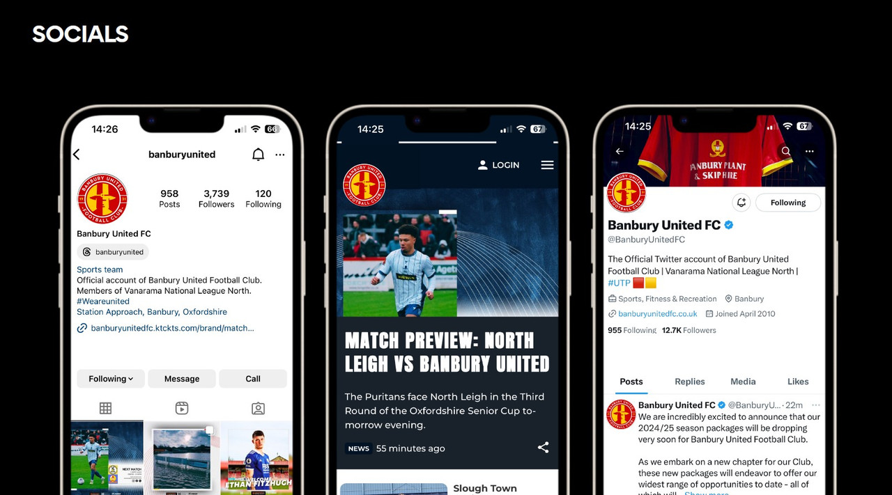
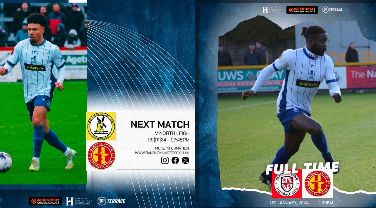
See below for various logo applications:
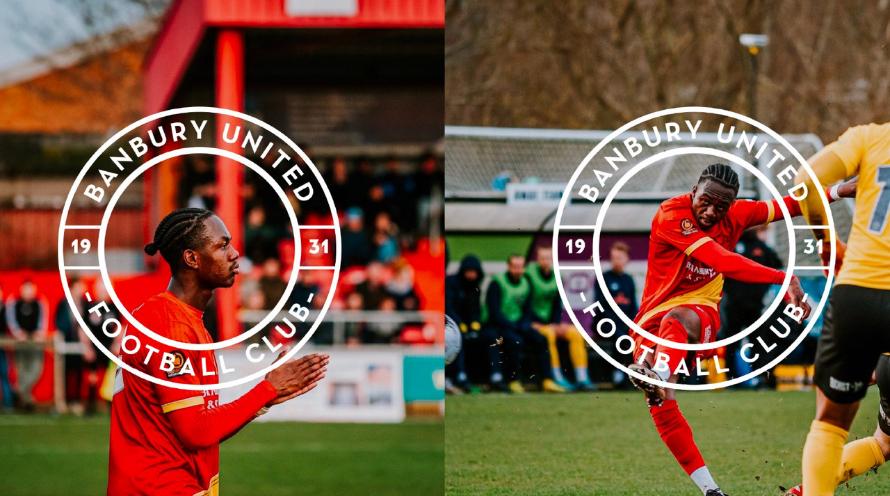
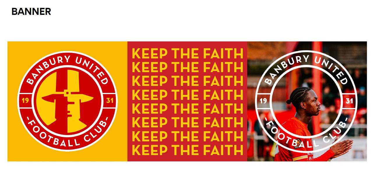
Banbury explained why this particular design route was chosen. It answers why we are continuing to use the Puritan man in this iteration of our identity at this point in time (as opposed to other Banbury-related symbols), as well as how no costs have been incurred in its development. This is not an expensive project for the Club, but it is the start of attracting a lot more wealth into it.
Thanks to everyone who completed our recent consultation survey on the new logo direction, and on some other key Club experiences. 208 of you took part, with almost half of you sharing your thoughts as comments in the survey. This was really helpful to the Board and the design team. We’ve been able to see where the consensus lies and move the project forward accordingly.
Echoing feedback provided in and outside of members’ meetings, a clear majority of respondees, 68%, were in favour of a change to the Club logo. Sixty per cent supported the creative direction presented.
Of the six logos presented within the presented theme, Option 5 – a red Puritan man on a yellow background (see image below) – was the most popular logo choice with 52% of the vote. The second favourite, Option 6, with 25% of the vote, was very similar as a black Puritan man on a yellow background.
This supporter feedback gave a clear mandate to progress Option 5, addressing fan feedback to develop the Puritan man to be more recognisable as such and with added facial detail. We are very confident that this brief has been delivered.
There was lots of feedback for us to read: positive, negative and everything in between. We’d like to address two of the main points expressed here:
Why is the Club spending lots of money on this project?
The logo design project has not cost the Club a single penny. It has been undertaken by volunteers at the Club and with the pro bono support of Above+Beyond, an independent award-winning creative agency based in London. The opportunity came through Banbury-born and Banbury United fan, Ash Prentice – he’s a Senior Creative at the agency and introduced us to his employer last year. We feel incredibly fortunate to have made this connection and to be able to work with the same designers who have contributed to brands such as Subway, Amazon and Mulberry, as well as charities including Shelter and Alzheimer’s Research UK. Above+Beyond’s leadership team loved the idea of supporting the initiative with Ash having such a link to the town and are on board to help us with building our brand longer term. All of that starts with the logo.
As with all rebrands, there will be some on-costs of course, but this will be a minimal investment. Most of the applications of the logo are digital, incurring virtually zero cost. Next season’s kit will be new in any case so a new logo is not an additional cost there. For physical elements such as signage around the ground, we will update this at a pace the Club can afford and in conjunction with production support from sponsors. Any brand investment, be that in hours or money, will be returned in a new modern look and feel that wider audiences will feel attracted to buy into.
Should the Puritan man, and all he represents from a different time in history, have a place in 2024? Shouldn’t we be reviewing his presence in our logo at all?
We were aware when embarking on this logo project that this is the first time, at least in modern times, that the Club has embarked on a formal logo development process with supporter consultation. This article goes into more detail about how the current logo came about and is useful context.
Full disclosure: we opted to play it safe, heritage-wise, in this our first step in professionalising the Club brand. Hence, the brief was to stick with the Puritan man and bring him up-to-date in a more appealing fashion.
We concluded that the question of whether the Puritan man should be part of the Banbury United identity would need to be a matter for a separate consultation; a fundamental conversation within the Club that goes way deeper than a logo project. It would have required a consultation before a logo consultation, involving discussions around Club tradition and heritage and the use of our nickname, the Puritans.
Working around people’s full-time jobs, this logo project has taken more than half a season to complete, after an initial (and failed) aspiration to have done this ahead of the 2023/24 season! Given the resource restrictions we’re faced with as a volunteer-run Club, we made the call to address the negative feedback about the current logo in time for next season’s kit, and to give us the best chance of attracting new investment into the Club as soon as possible.
We know from your comments that feelings towards the Puritans from history are not all positive. We would like those within our women and girls’ teams, in particular, who expressed opposition to the Puritan ideology, to know that you have been heard and the strength of feeling has been understood. We are not alone in British football where there are a lot of archaic nicknames and associations with origins in history that are detached from their original intent.
Logo development is not a once-in-a-lifetime exercise. Some organisations refine their logos every few years. This project has created a blueprint for fan consultation and kick-started a conversation about our image that the Club will, for sure, revisit as part of ongoing brand refresh activity.
This is how fans reacted as Banbury United unveil their new club crest after a fan consultation process…
@jamesxworth: Great work! Love these
Stephen Rogers: I like the new crest looks great 👍
Nick Hill: I like it think it looks quality!
Sian Griffiths: I really like well done all 😊
Matt Bragg: Really good job all round
Richard Owens: Rate it 👌
@mattbraggcomedy: Great work 👍🏻
Kevin Howse: Yes I think I’m starting to like it, can’t wait for some more news. ❤️💛
Liam Reading: Personally like it, a lot better than the previous one which was just simply unmarketable






You must be logged in to post a comment Login